Welcome to Formflow's Quickstart Guide. In this series, we will explore the Formflow Dashboard, learn how to create your first form, and understand the various elements within the Canvas. Whether you are gathering feedback, automating recruitment, developing customer onboarding workflows, creating a quiz, generating leads, or any of the other countless things you can build, Formflow makes it simple. Let’s get started!
After logging in, you’ll see the Formflow Dashboard. Let’s take a quick tour of what’s available:
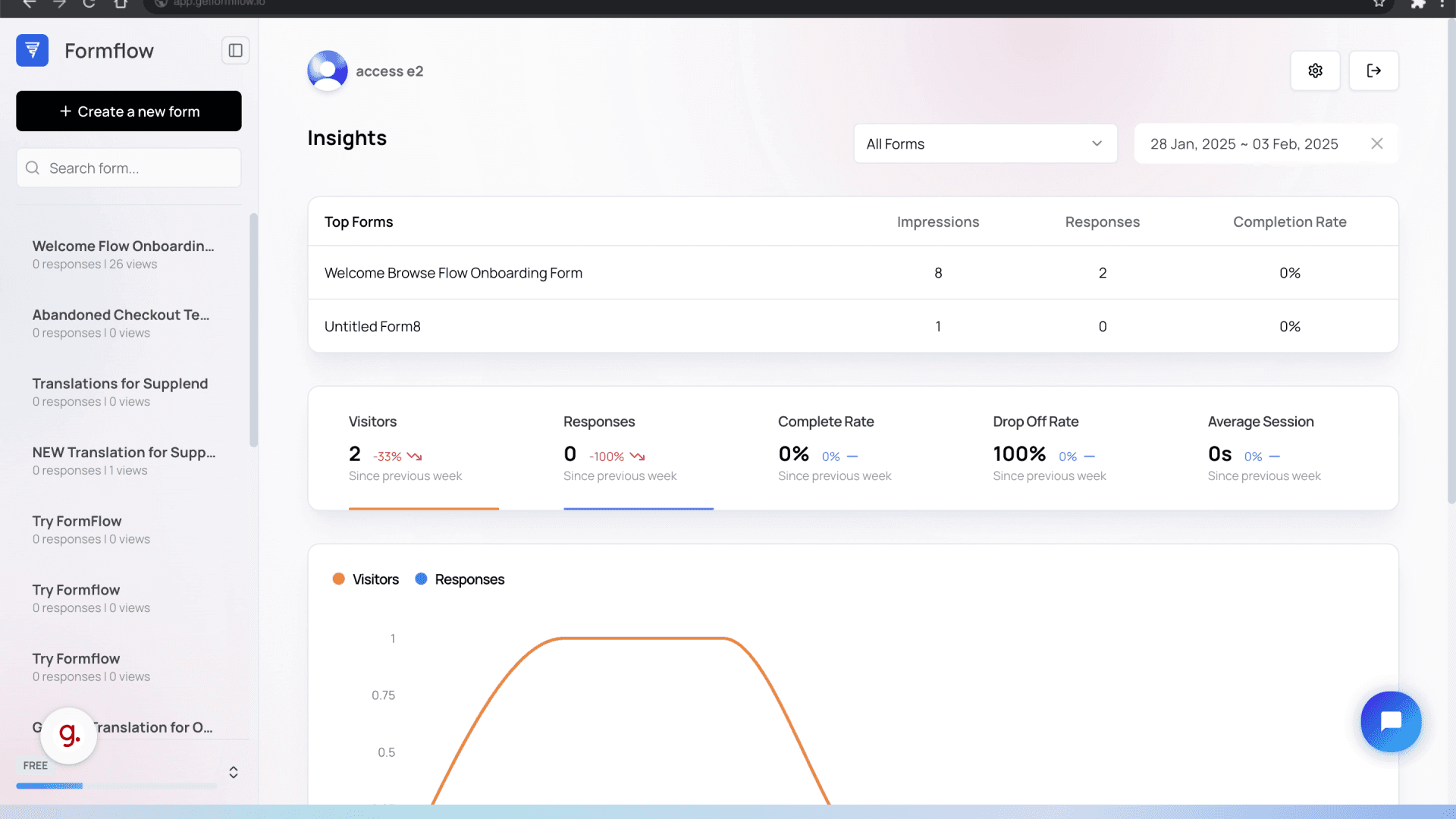
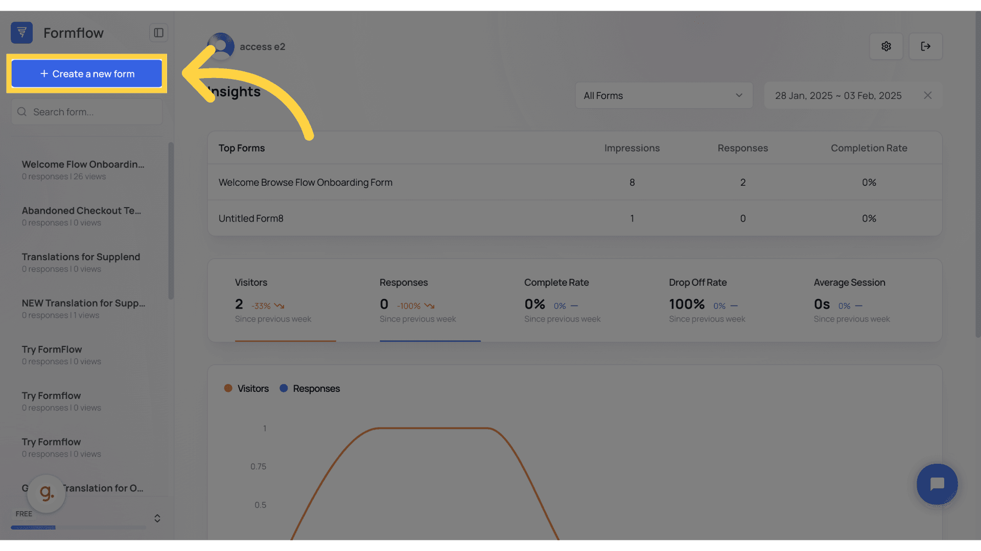
"Create a New Form" – Here, you can start building your form from scratch.
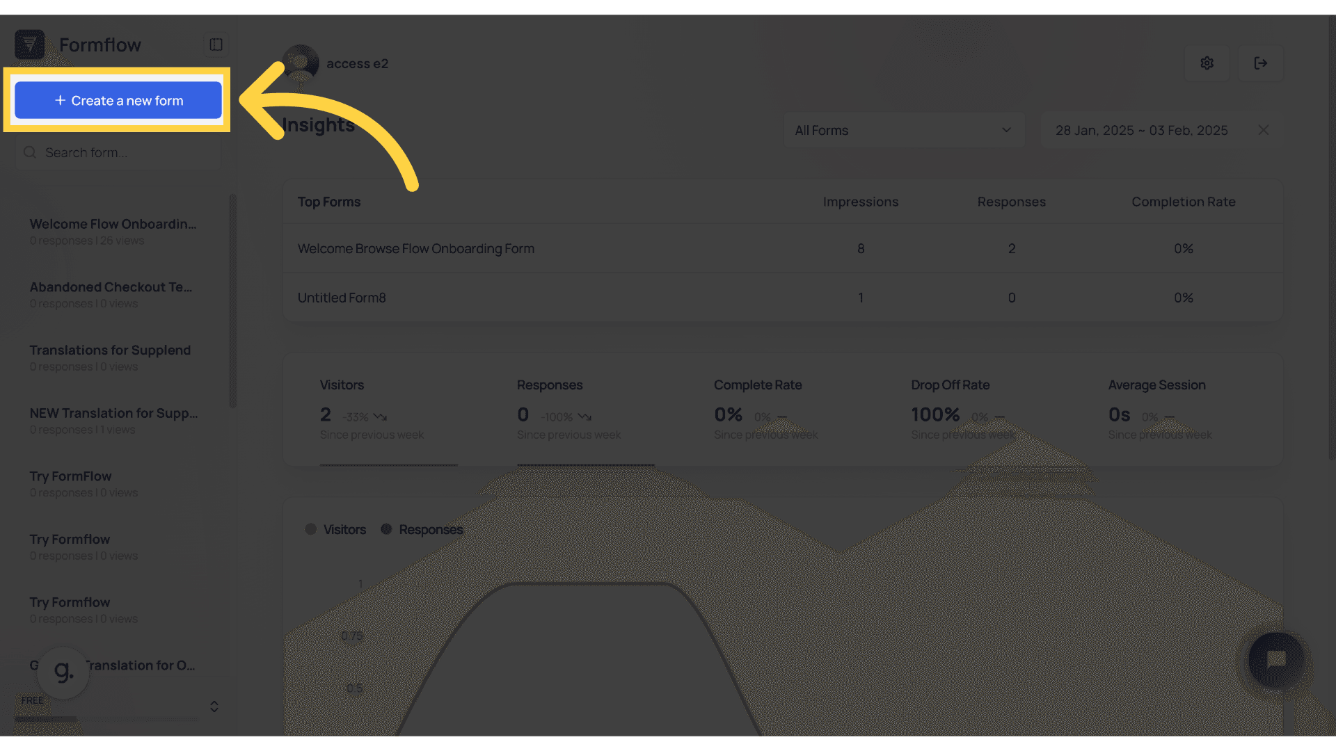
Here is a list of your forms – you can easily access all the forms you’ve created. You can also search for forms using the search bar.
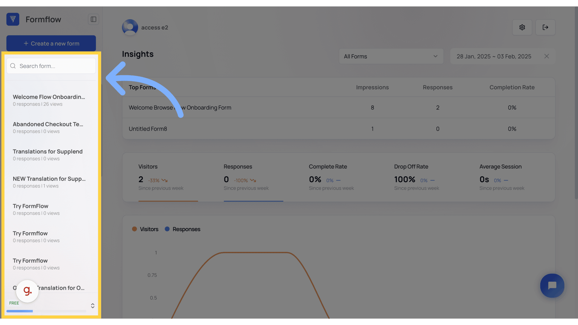
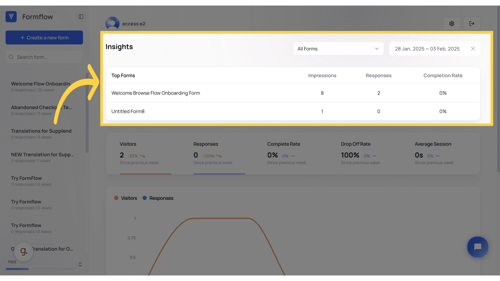
Let's take a look at the Insights Panel: Here, you can track your form's performance such as Total Visitors, Responses, Completion Rate, Drop-Off Rate, and Average Session time.
This table displays the forms that are performing best based on impressions, responses, and completion rate. This dashboard offers an overview of how your forms are faring and assists you in tracking user engagement.
Now that you have a pretty good understanding of the Dashboard, we're ready to dive into the Canvas.
Start by creating a new form.
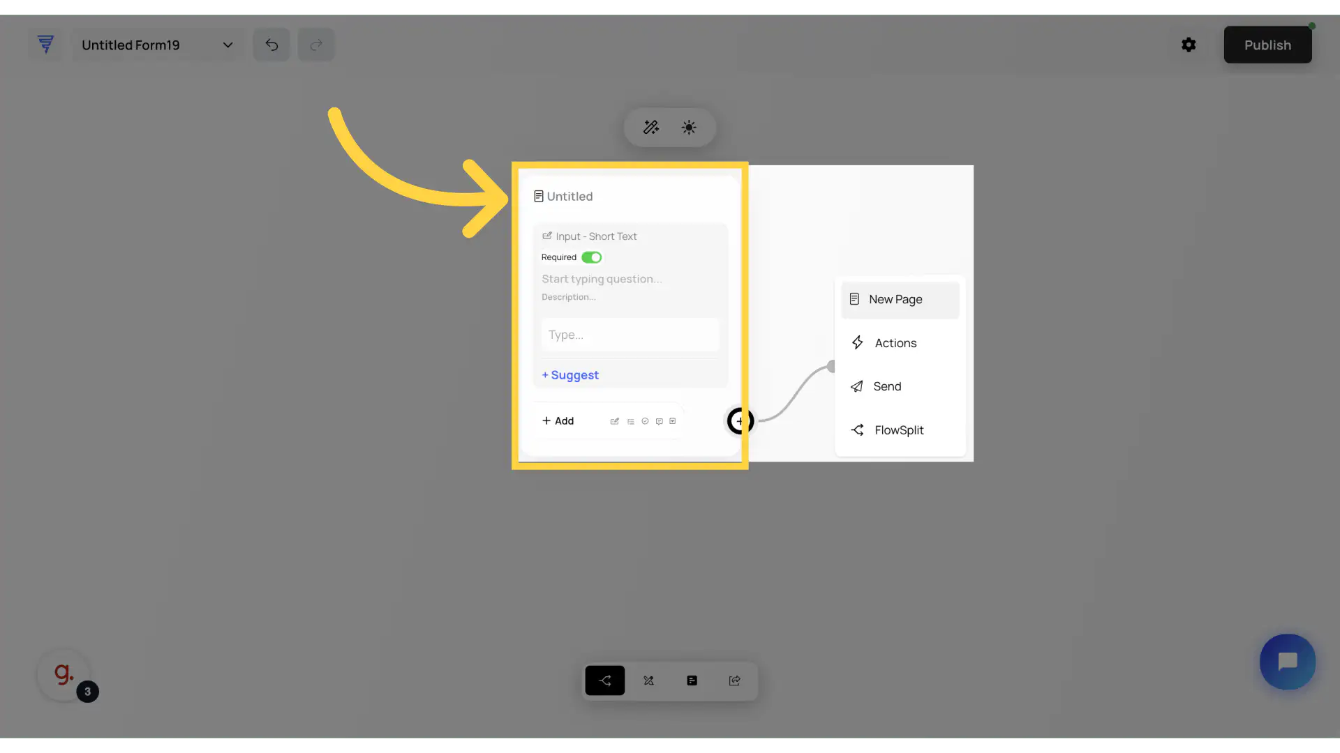
Before we begin, let's understand what the nodes in Formflow are. When we add our first element to the form, this is called a node, and it acts as a "page". The node system enables you to easily build a complex form using the visual drag-and-drop builder; a new node, "page" is how you create a multi-step form... but we'll dive deeper into that later.
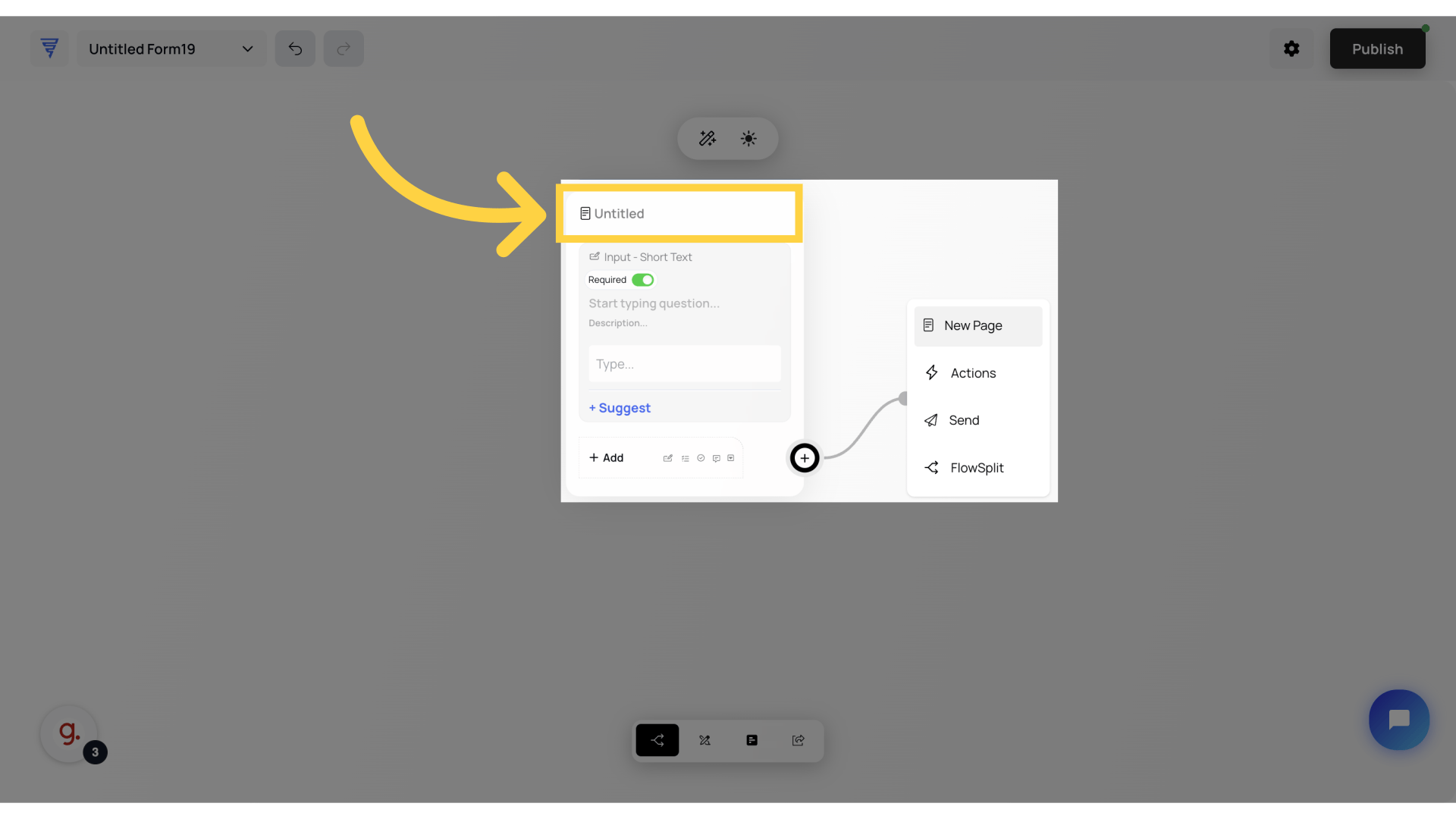
If you wish to change the name of this page, here is the title that you can rename by editing it.
And if you wanna change name of this page, here's the Title that you can rename by editing it.
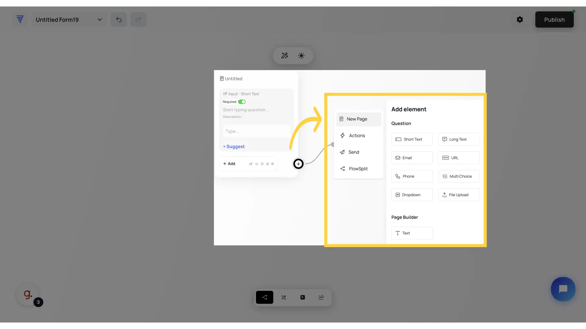
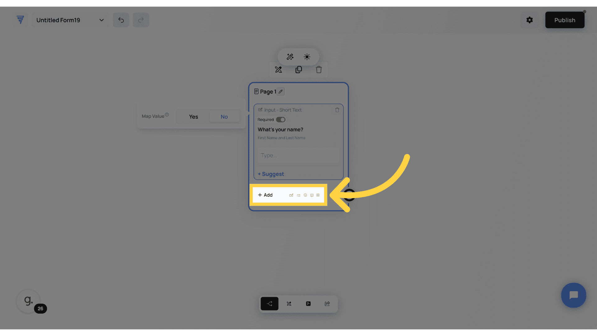
To add more questions, click add and you can select from a wide range of Elements. Remember, the elements you add are only to this page.
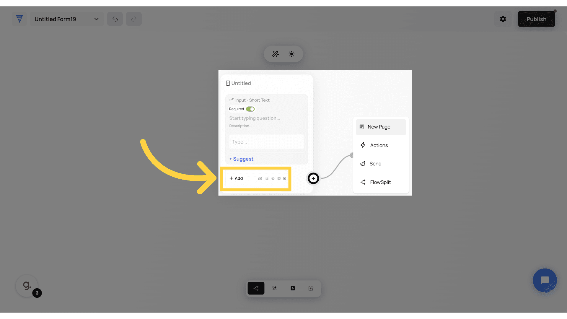
Press the plus button on the bottom right corner of the node, drag your mouse into an empty space, and a new page is created! This makes it easy to build interactive, step-by-step journeys effortlessly. How easy was that?
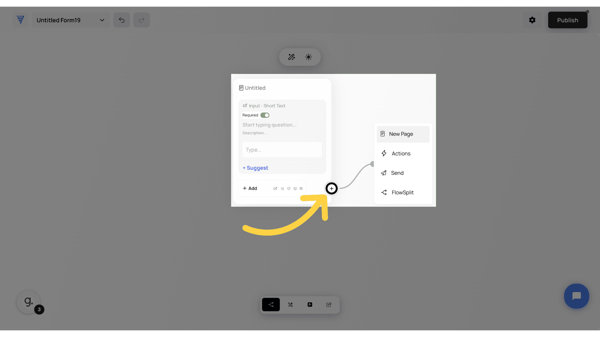
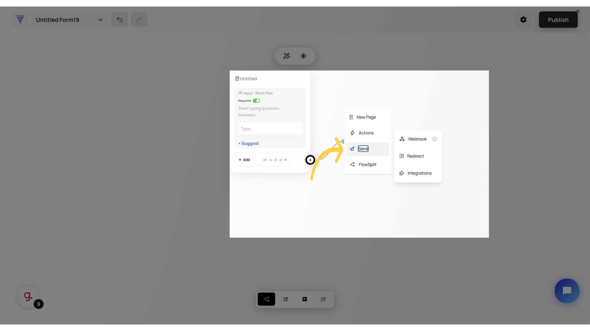
Now there's a few options you have when dragging into an empty space... You can create a new page, which will act as a Multi-step form
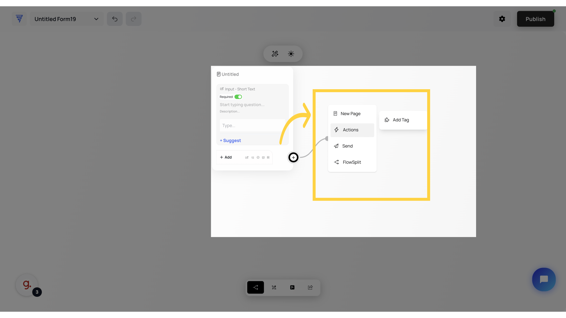
Or you can click the actions option, and add things like a "tag" enabling you to better organize your audience.
Or, you can perform an Action by clicking Actions and select "Add Tag".
When you want to send all of your data somewhere, you can click send to either send it to a Webhook, Redirect it to any external URL or you can even choose from the available integrations.
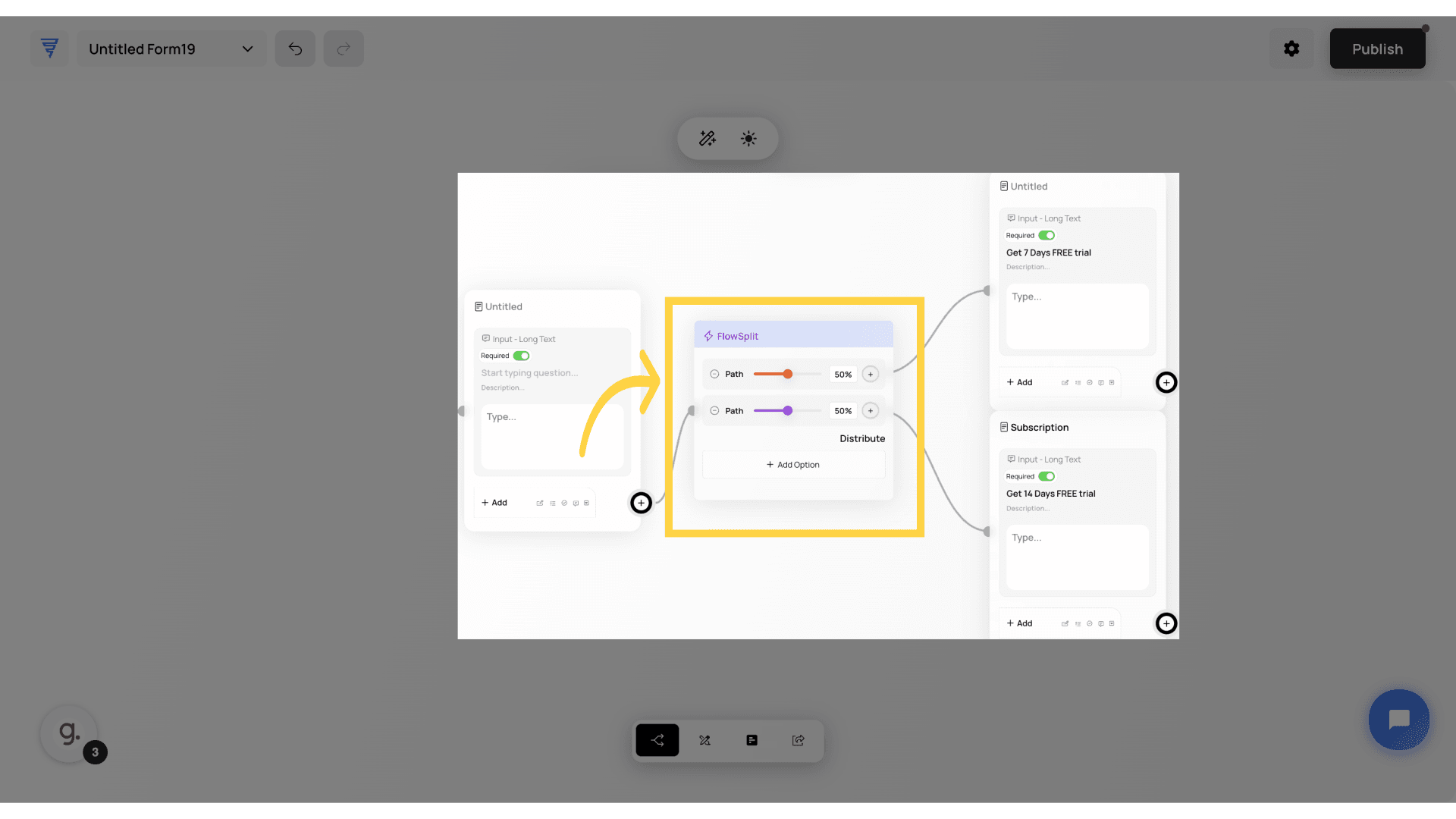
As a marketer, one of my favourite features is FlowSplit. By pressing FlowSplit, you can create an A/B test. This will generate an option, and you can add as many as you wish, choose the traffic split, and Formflow will automatically present these questions to your audience, allowing you to determine what works best. Pro tip: use the visual analytics to analyse which step performs best!
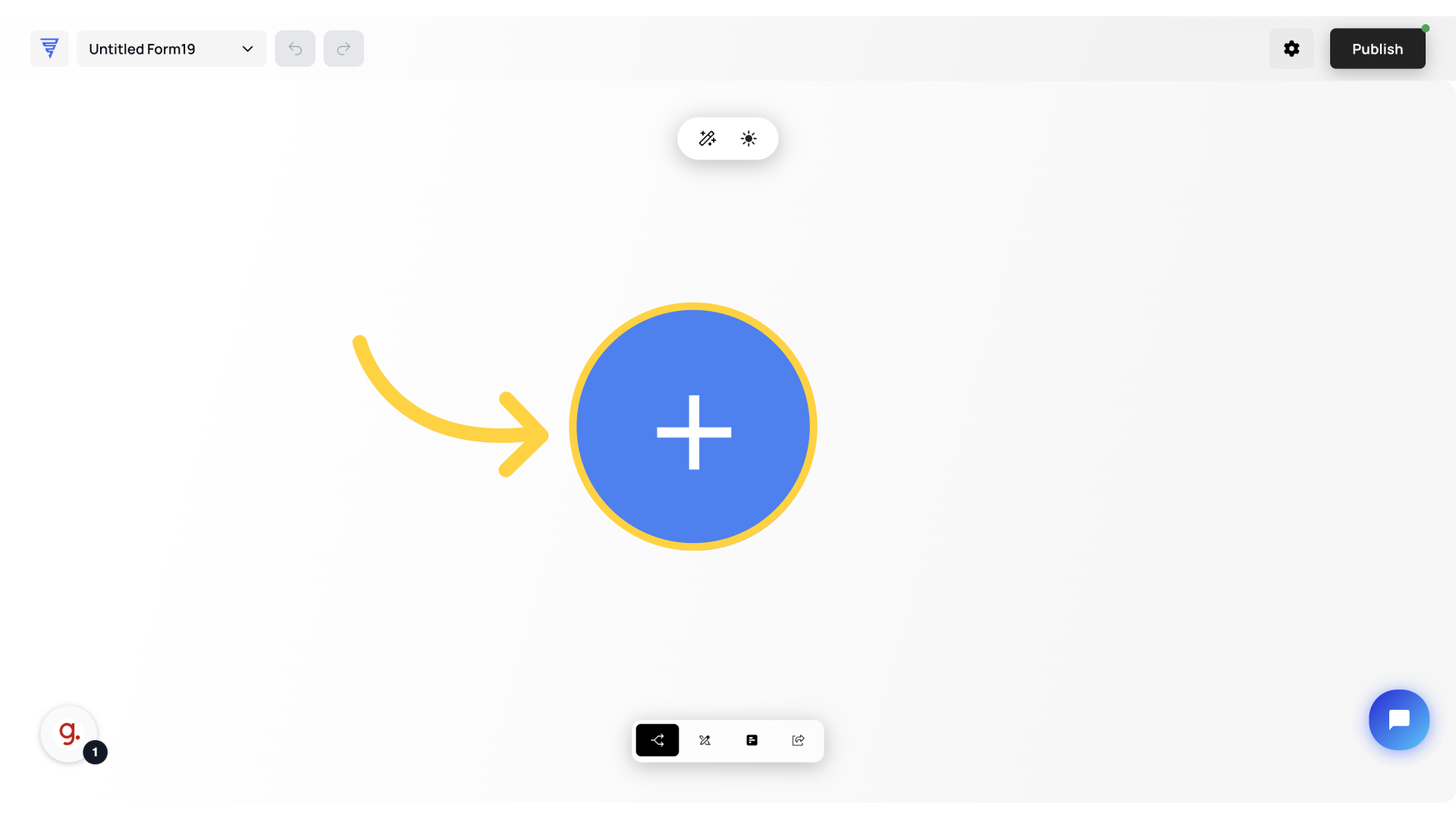
Now, let's start from the beginning as if we've just loaded up our brand new form and we're about to get started. You'll be presented with a big blue circle with a white plus in the middle, click this to begin choosing your very first question.. Let's go over these elements in more detail.
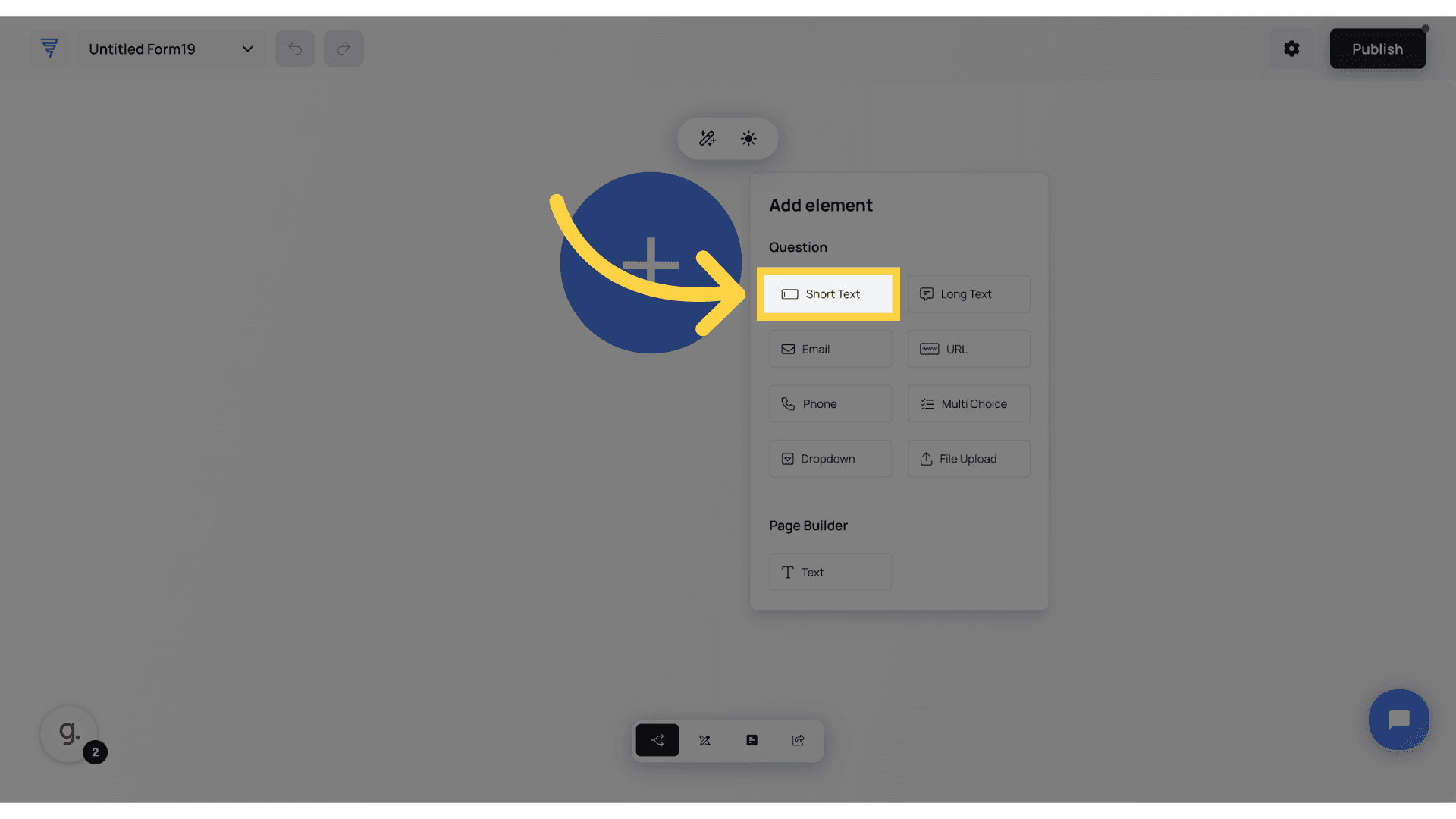
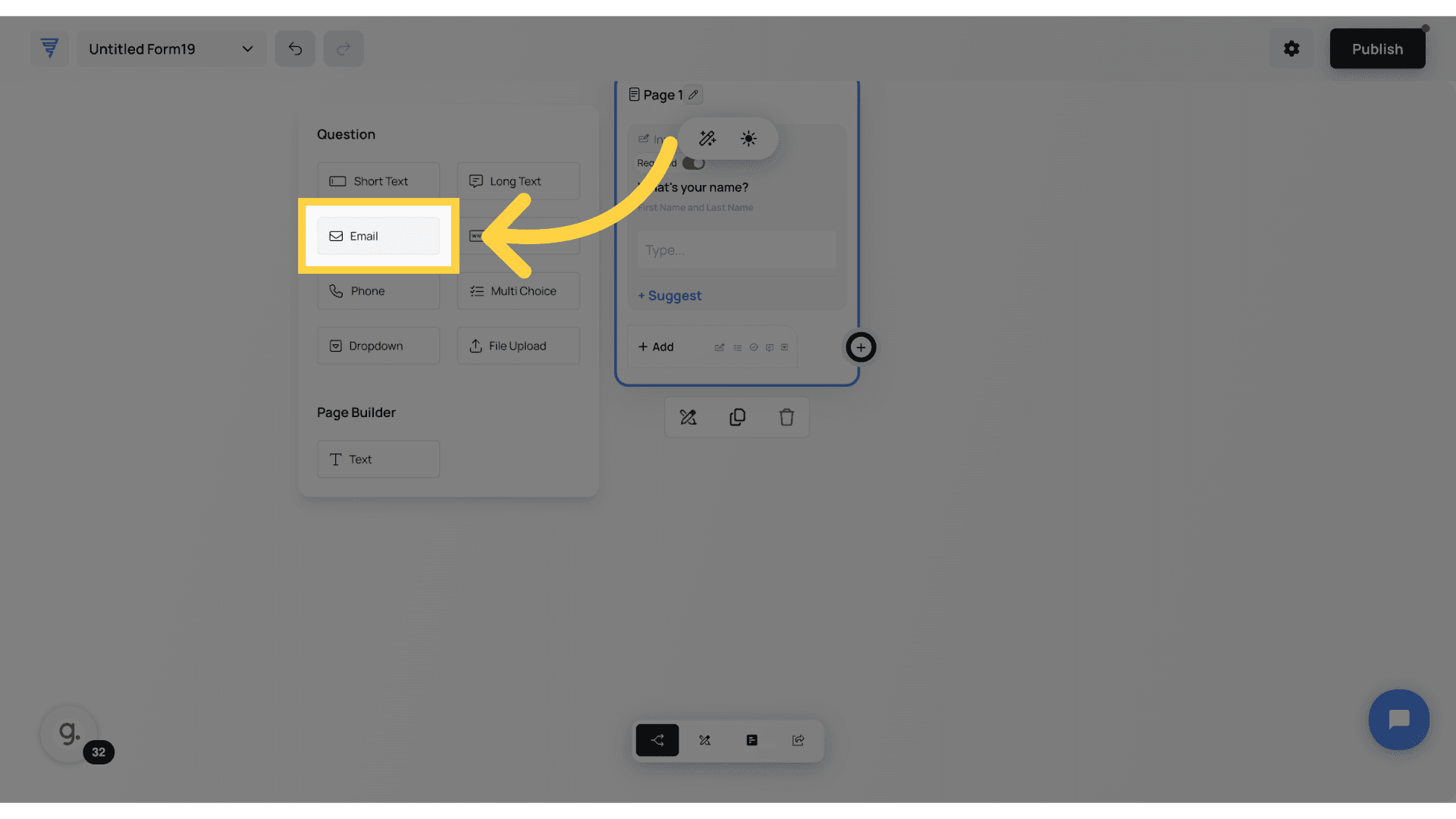
When you click "Create a new form", you will see the Canvas builder. Here, we will add a new element to our form. We have multiple elements to choose from. Let's understand each Form Element in detail.
The Short Text element is perfect for capturing quick one-line responses from users. Whether it’s a name, a title, or a short piece of information, this element keeps inputs clean and structured. Unlike long text fields, it’s designed for short, to-the-point answers, ensuring users don’t type more than necessary. So, where can you use it? Capturing Names – Whether it’s first names, last names, or short identifiers, this element keeps responses clear and readable. Job Titles or Custom Labels – Great for roles, positions, or any short descriptor users need to enter. Quick Responses – Use it for short answers in surveys, quizzes, or feedback forms where only a few words are needed. In short, if you need a simple, structured response without multiline input, the Short Text element is your go-to choice!”
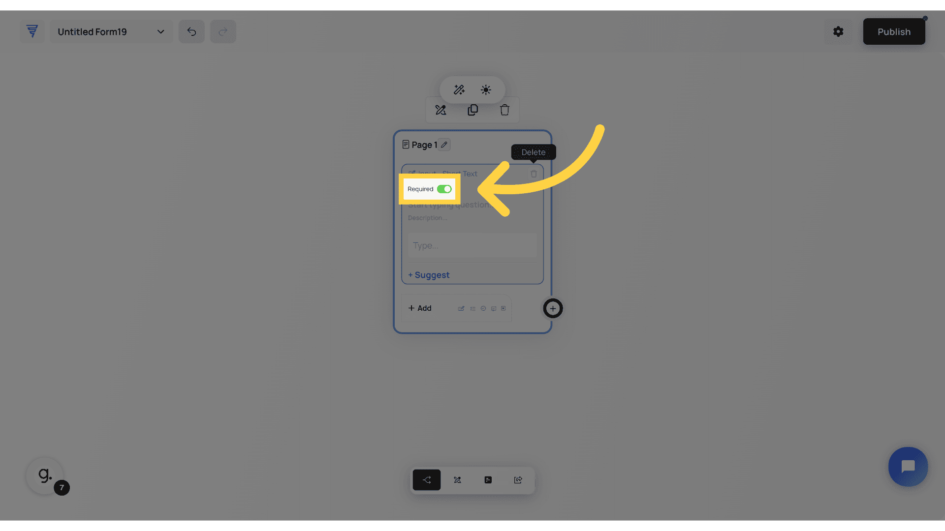
Click here to set this filed as mandatory.
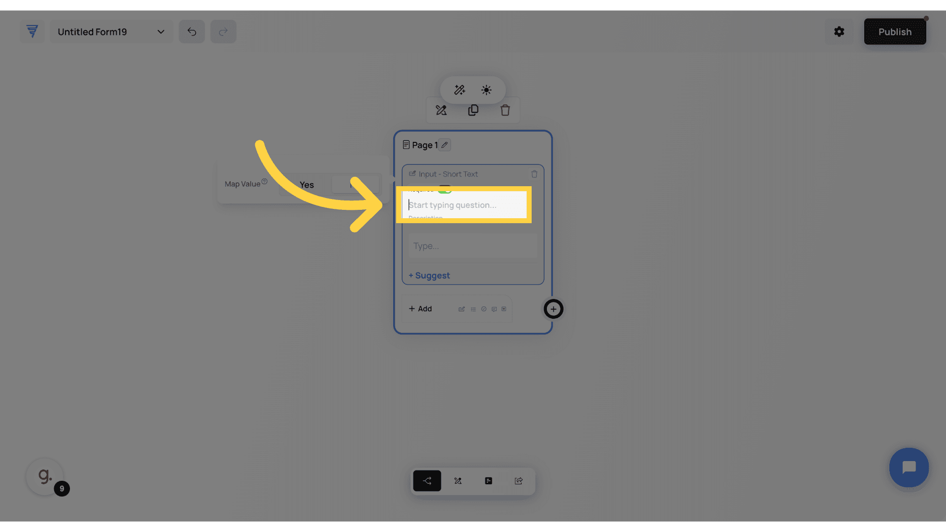
Click here to start typing your question like "What's your name?"
Add a description to your form such as: First Name and Last Name

Now, let's understand the other elements by adding our second one to this same page. Click "Add"
The Email Field is designed to capture valid email addresses with built-in formatting to prevent incorrect entries. Unlike a short text field, it specifically ensures users enter a properly structured email. Here’s when to use it. Lead Capture Forms – Collect real emails from potential customers for follow-ups. Account Sign-ups – Ensure users enter a valid email when creating an account. Newsletters & Opt-ins – Gather emails for marketing lists while maintaining quality. Pro Tip: To prevent fake or mistyped emails, enable email validation. It’s a small charge per validation, but it keeps your list clean and protects your email deliverability.
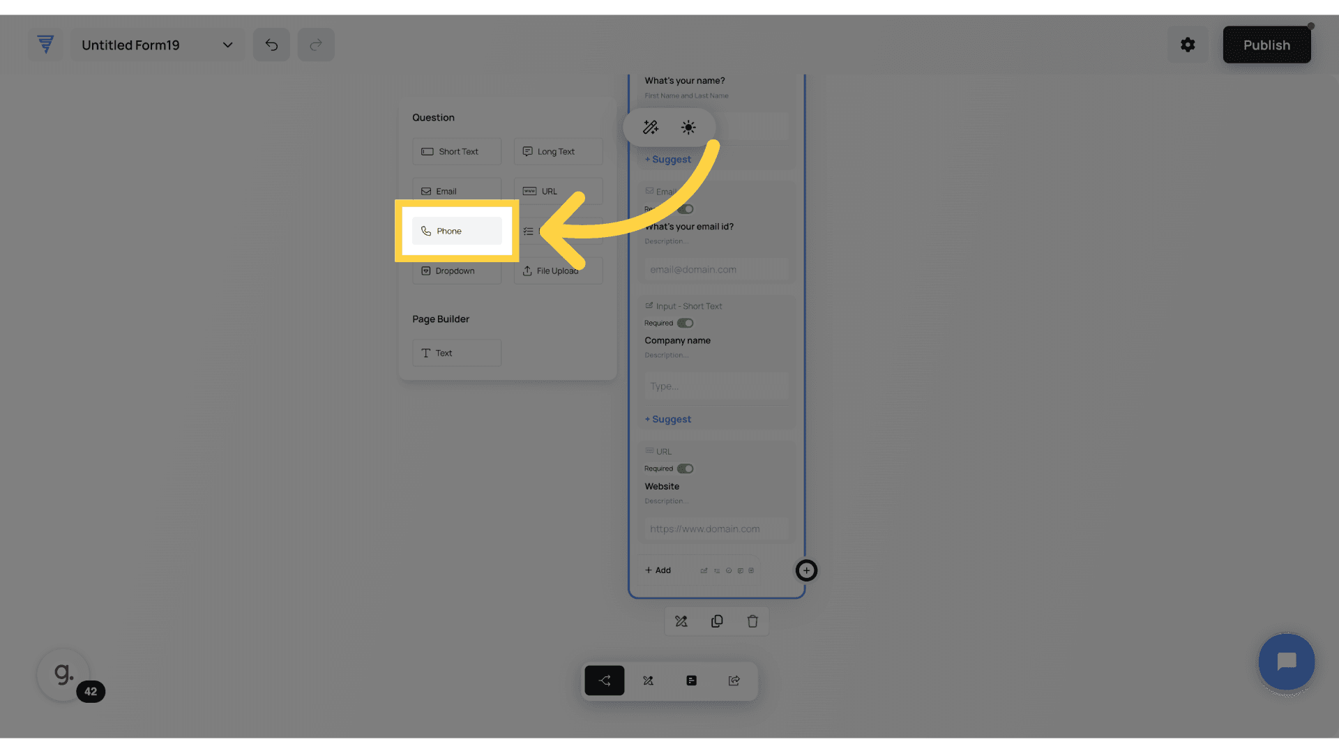
The Phone Field ensures users enter a properly formatted phone number, making it ideal for contact collection. Unlike a short text field, this element can enforce number formatting and country codes for better accuracy. Here’s where it’s useful. Lead Forms and Customer Inquiries. Collect phone numbers for follow-ups and support. Appointment Bookings – Ensure users provide a valid number for confirmations and reminders. Order & Delivery Forms – Capture accurate contact details for smooth logistics.
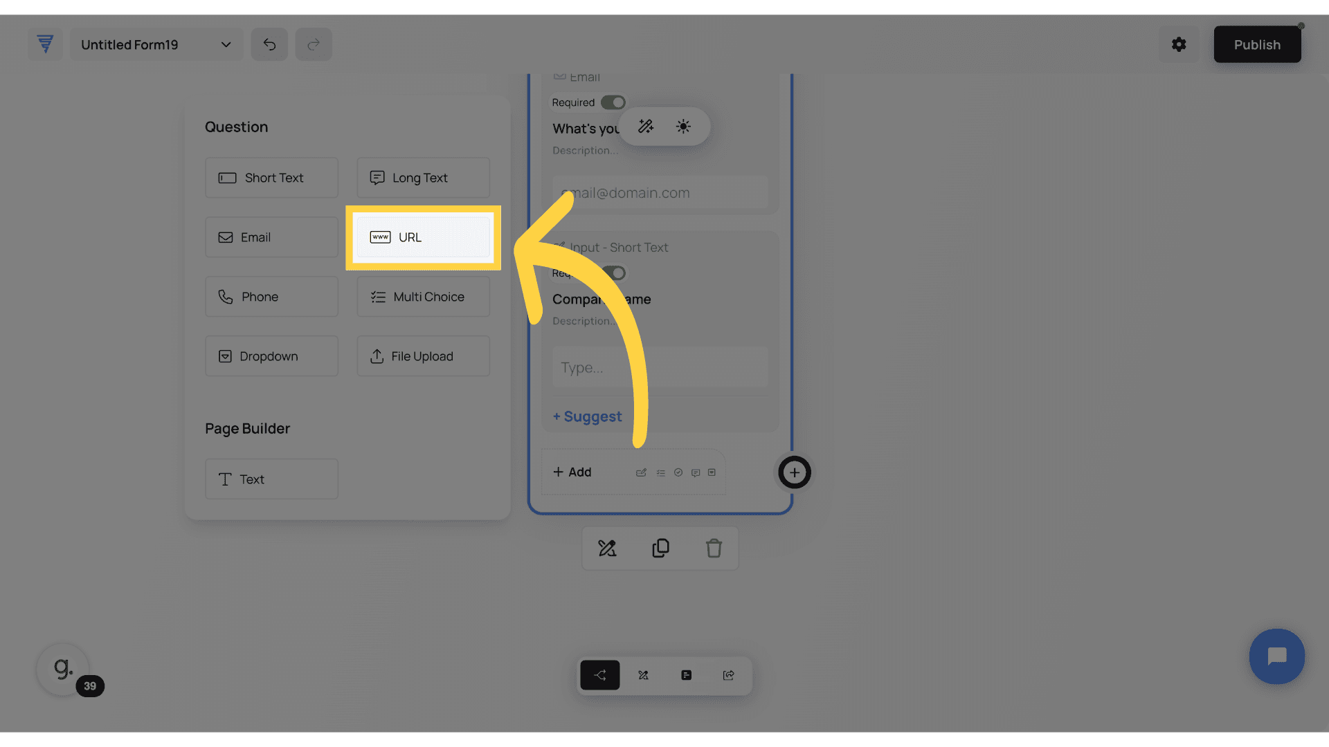
The URL field is designed to collect valid website links, ensuring users input a properly formatted URL. Unlike a short text field, it automatically detects whether the entry follows a correct web address format, for example, starting with http or https. Here’s where it’s useful: Website and Portfolio Submissions, allow users to share their websites, portfolios, or social media links. Customer Feedback and Testimonials, enable users to submit links to reviews, blog posts, or relevant resources. Affiliate or Partner Forms, gather referral links or promotional URLs for tracking purposes.
The Long Text Field is perfect for collecting detailed responses that go beyond a single line. This element allows multiline input, making it ideal for gathering longer explanations, feedback, or descriptions. Here’s where it’s useful: Customer Feedback & Testimonials – Capture in-depth responses about user experiences. Project Descriptions – Allow users to submit detailed requirements, ideas, or briefs. Support & Inquiry Forms – Give users the space to explain issues or ask complex questions.

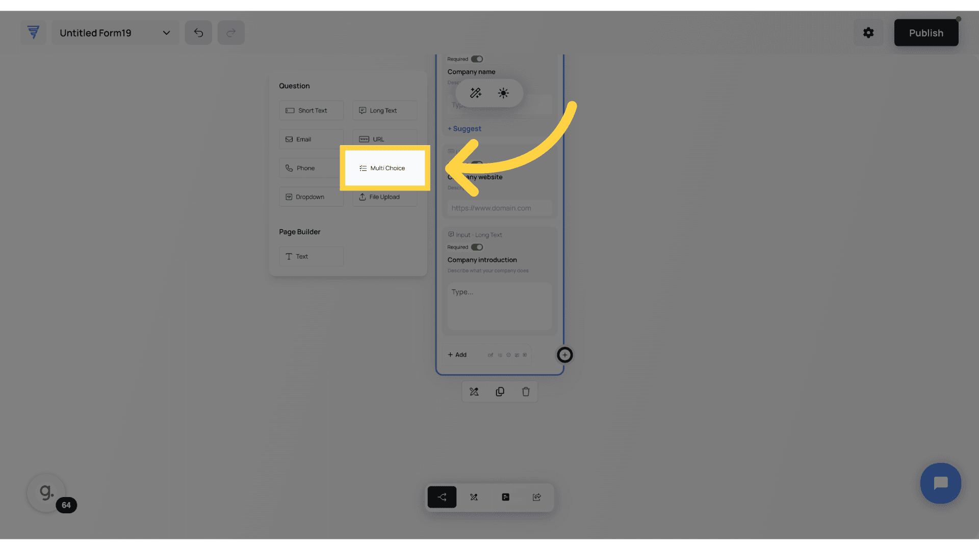
The Multi-Choice Field lets users pick one or multiple options from a predefined list. This is great for structured responses, making it easier to collect clear, categorized data. Here’s where it’s useful. Surveys & Polls, Let users select preferences, interests, or opinions. Product & Service Selection, Allow users to choose features, add-ons, or service options. User Segmentation, Gather insights on demographics, industry, or usage preferences.
Pro Tip: Set it to Single Selection if you only want one answer per user. Plus, you can now drag out individual pathways for an interactive experience based on their selection—perfect for branching logic and personalized form flows!
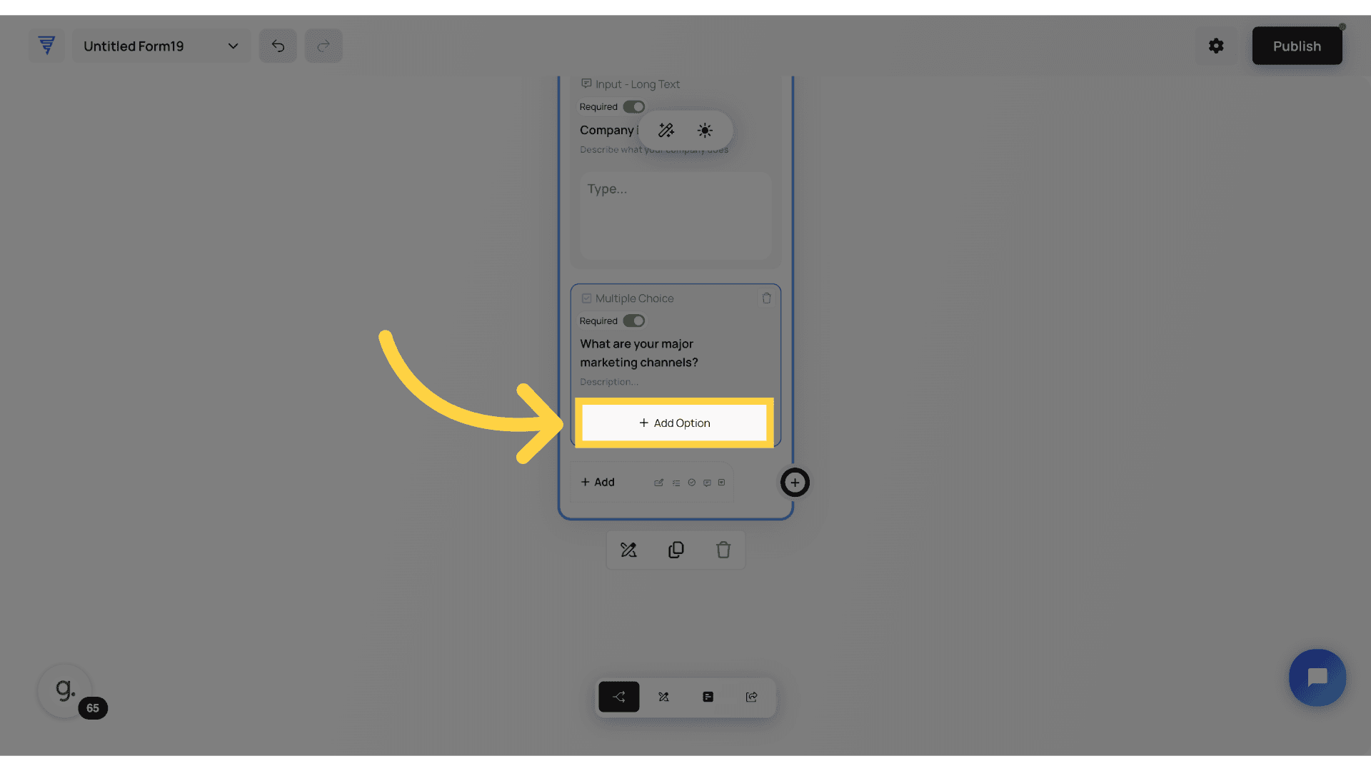
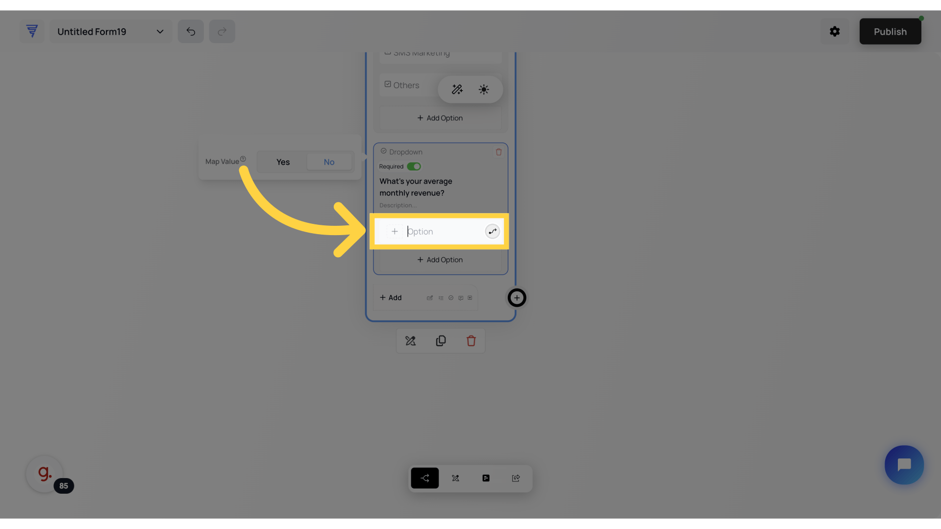
Adding options is incredibly simple! Just press the ‘Add Option’ button, type in your choice, and it is instantly included in the list. Need more? Just keep clicking ‘Add Option’ and enter as many choices as you wish. Each option appears in real-time, giving you complete control over the selections available to your users.
You can do this by set choice to Single or Multiple depending on the response type. The multiple choice is a very powerful option for creating interactive pathways depending on the response as shown here.
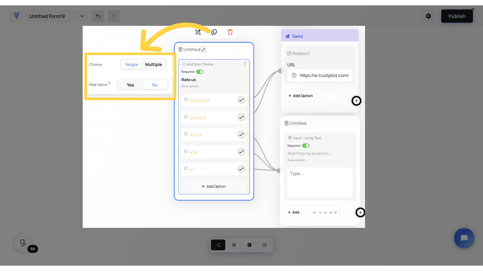
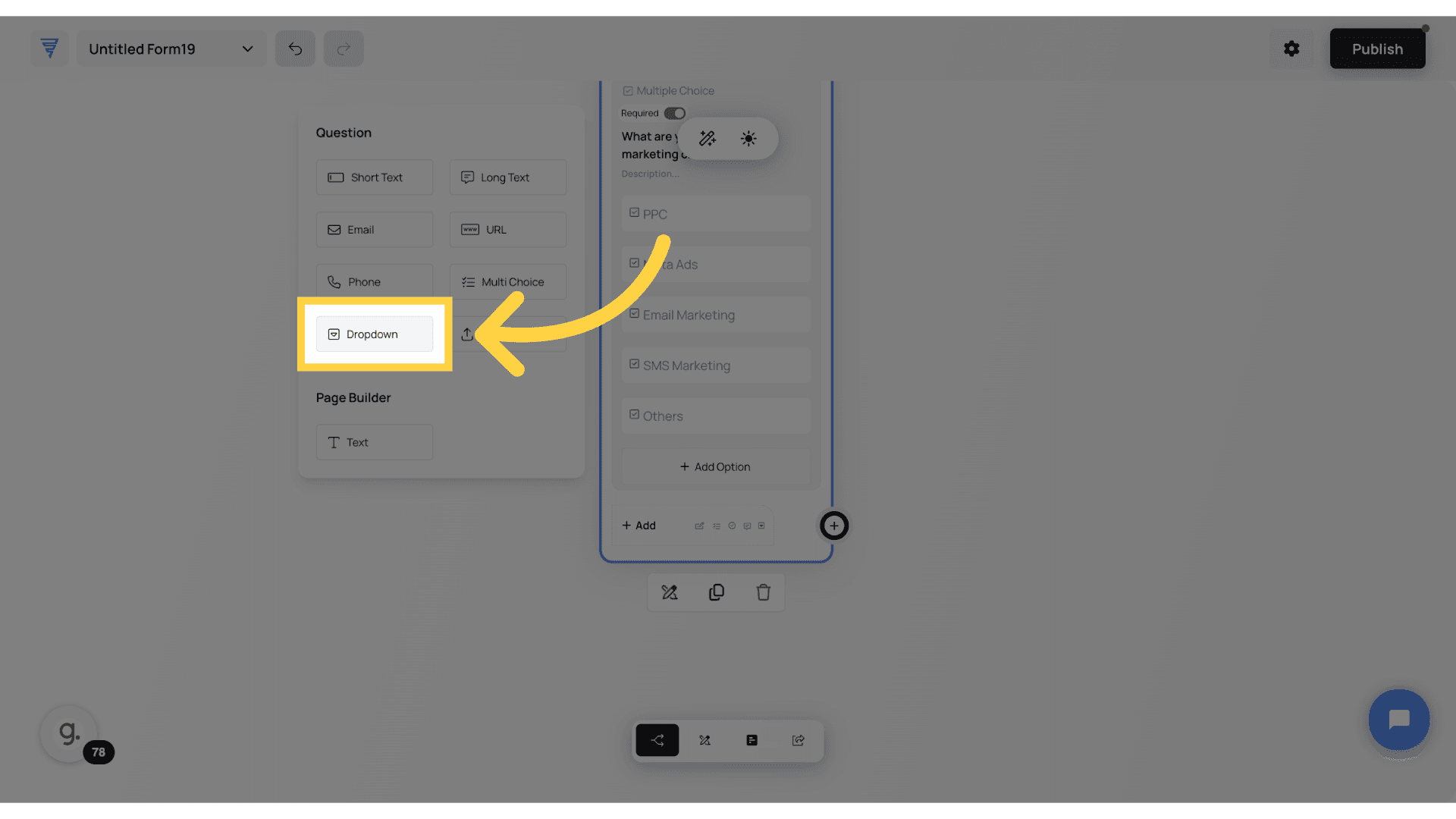
The Dropdown Field lets you display multiple choices in a compact, space-saving menu. Just select ‘Dropdown,’ enter your question, and add your options. While Multi-Choice Fields offer more design flexibility, dropdowns are great for keeping forms clean and structured. Here’s where it’s useful. Long Lists of Options – Ideal for country selection, pricing tiers, or job roles. Reducing Visual Clutter Keeps forms tidy when too many options would overwhelm the design. Standardized Inputs, Ensures users pick from a set list without freeform responses. And Just like Multi-Choice, you can set it to single selection and even drag out custom pathways based on the user’s selection, allowing for interactive flows!
Click "Add Option" to add all the options for this question.
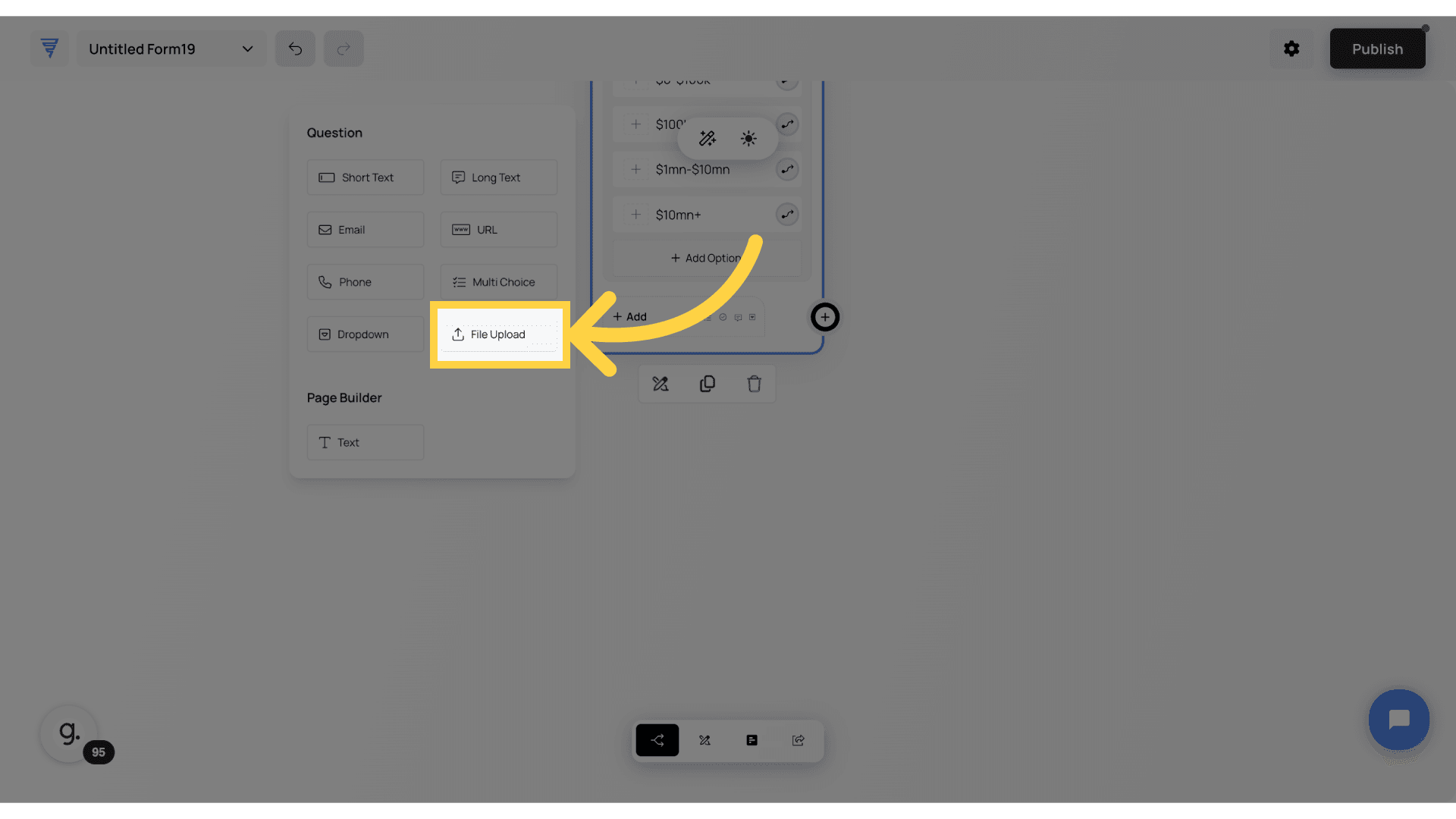
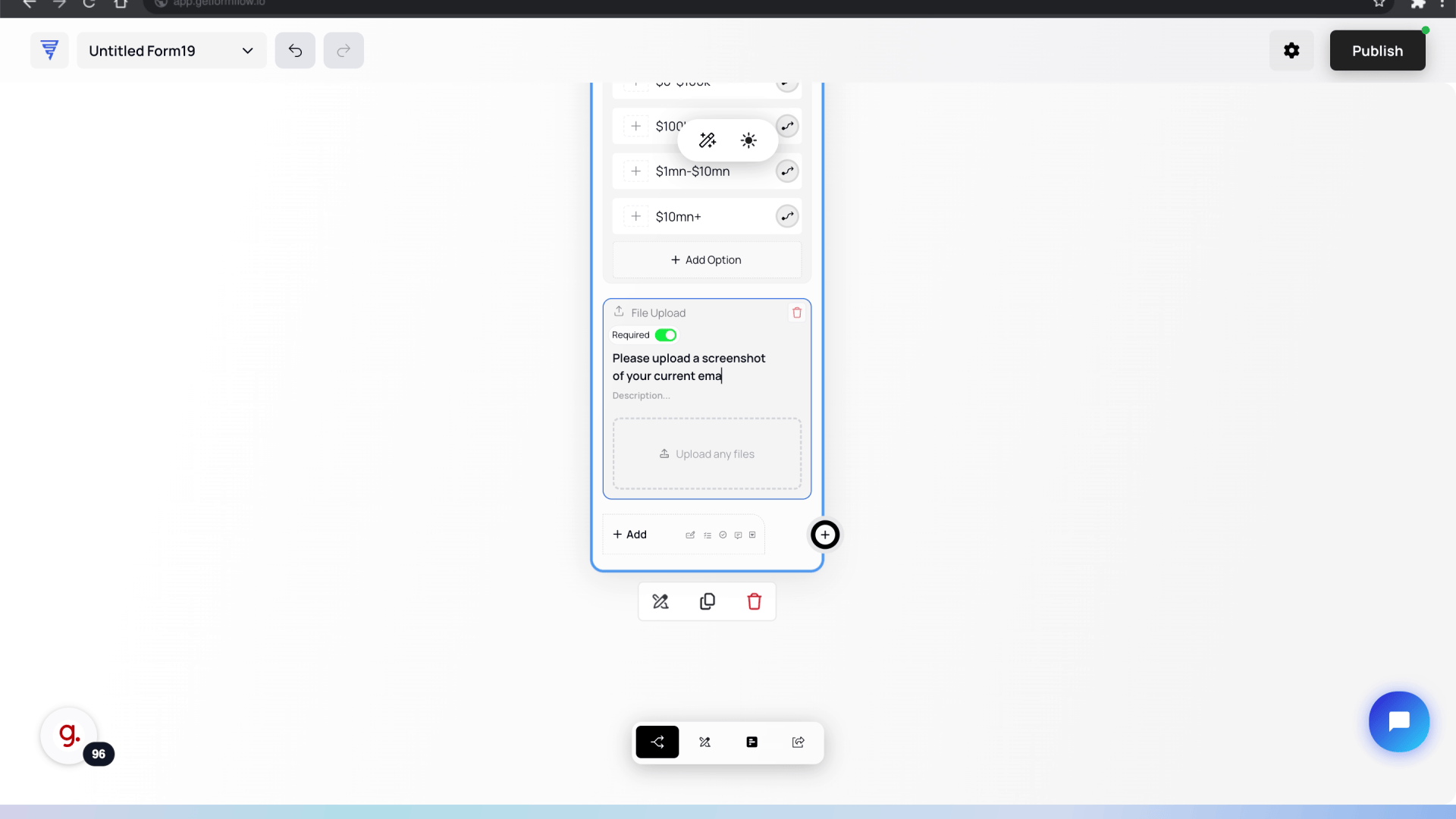
The File Upload field lets users attach documents, images, or other files directly to your form, and these uploads will appear inside the response details on the Results page for easy access. This eliminates the need for emails or external links, keeping everything in one place. Here’s where it’s useful. Proof of Work – Collect portfolios or past projects from designers, writers, or freelancers. Bug Reports & Technical Issues – Allow users to attach screenshots or logs to explain errors. Verification & Documentation – Gather ID copies, signed contracts, or any required paperwork.
Once you've added your element, setting it up is simple. To add your question, just type it into the question field—it'll instantly appear on your form. Need more context? Use the description field to provide extra details or instructions. And this little toggle here? That’s the Required Toggle. When it’s green, the field is mandatory—users must fill it before moving forward. If you want to make it optional, just click until it turns gray—easy!
In this guide, we’ve covered everything you need to know about adding and customizing fields in Formflow—how to structure your form, configure different elements, and create seamless interactive experiences in the canvas builder. Now that your form is fully set up, it’s time to make it visually match your brand. Up next, we’ll dive into the Style Editor, where you’ll learn how to customize colors, fonts, layouts, and more to make your form look as polished as it performs.
Enter the desired text like "Please upload a screenshot of your current email designs (if any)"
In this guide we covered the basics on understanding and customizing forms in Formflow, including adding different field types, configuring options, and understanding different elements in the Canvas builder. Once you build the form exactly how you wanted, now it's time to style it. In the next guide, we will learn more on ho. to style your Forms in the Style Editor.