The Canvas allows you to build forms using different types of elements, each serving a unique purpose.
Element Types are grouped into four categories:
New Page
Send
FlowSplit
Conditional Split
This page covers all elements under New Page.
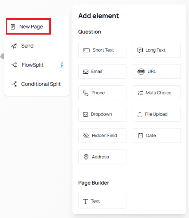
Including how they work and how to customize them.
Shared Characteristics Across All Elements
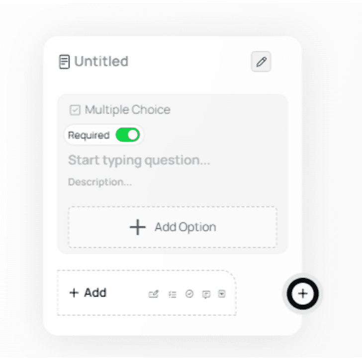
All question-based elements share the following core features:
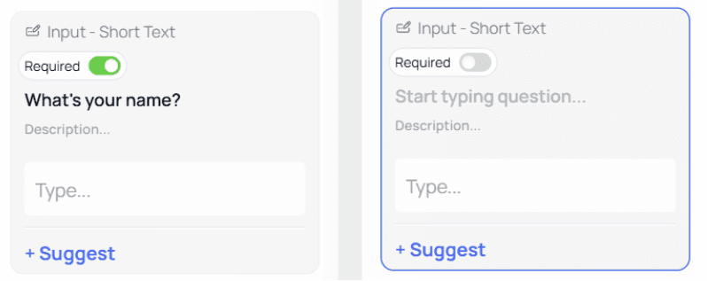
Required / Not Required Toggle
This toggle determines whether a question must be answered.
Green (ON): Required

Gray (OFF): Optional

By default, all newly added questions are set as Required.
Required questions are marked with an asterisk (*) in the live form.
ℹ️ Note:
Use Required only when necessary. Too many required fields can increase abandonment rates.Question Name
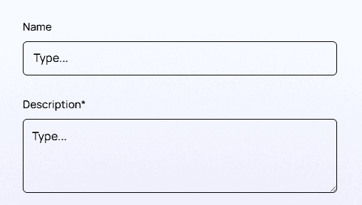
This is the main text of your question.
Description
Use the Description field to provide additional context or instructions for the user.
Descriptions help reduce confusion and improve form completion rates.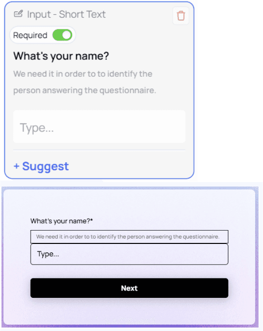
Input Field (Preview)
The Canvas shows a visual preview of the input field as it will appear to users filling out the form.

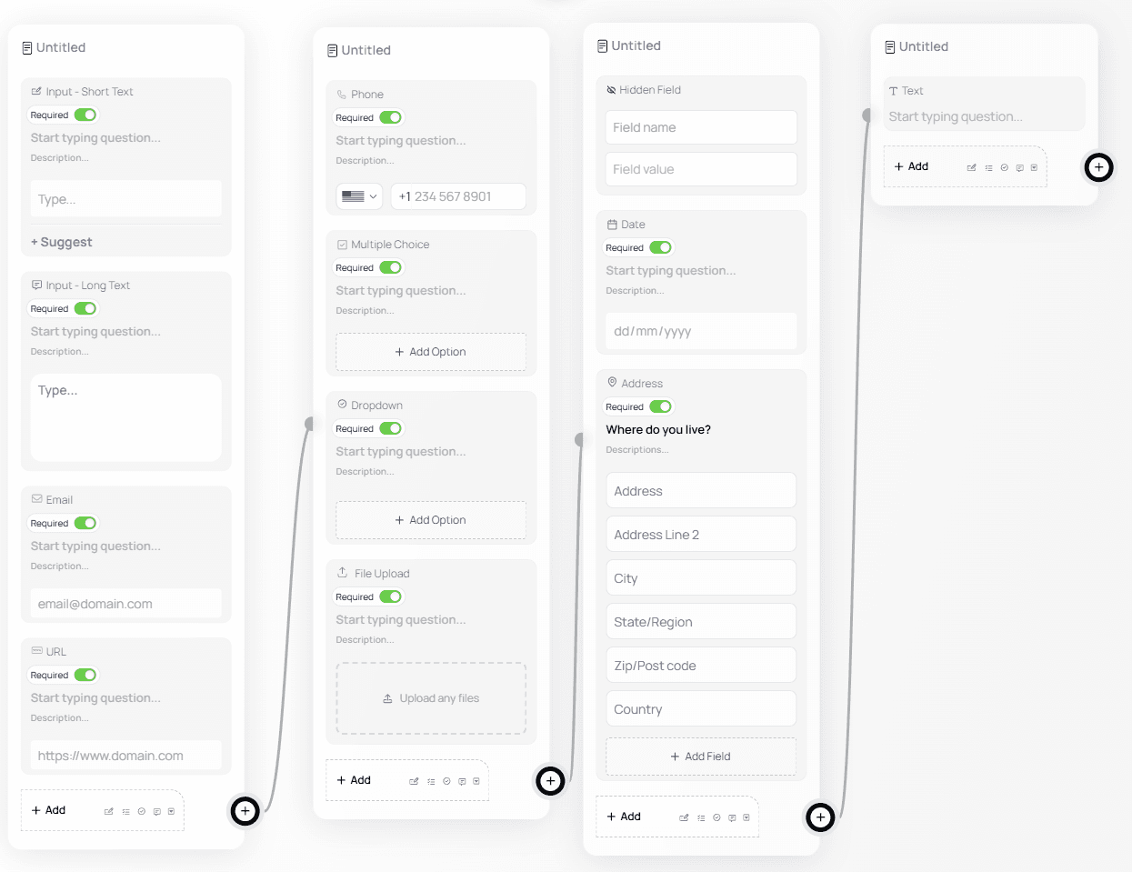
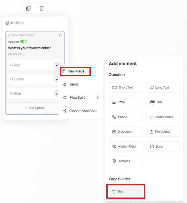
Element Types (New Page)
Below is a breakdown of each element type inside the New Page category.
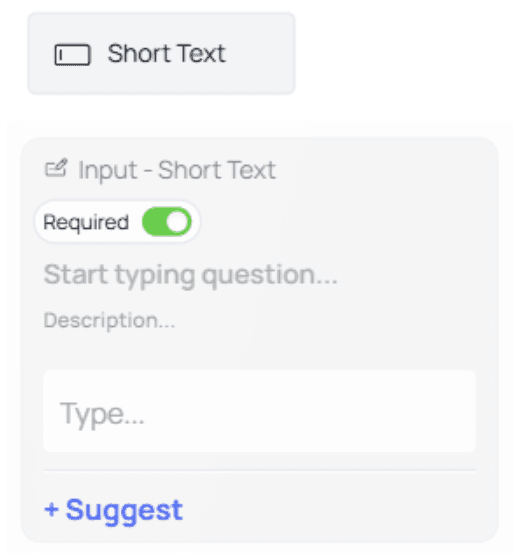
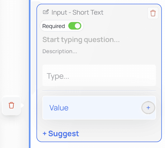
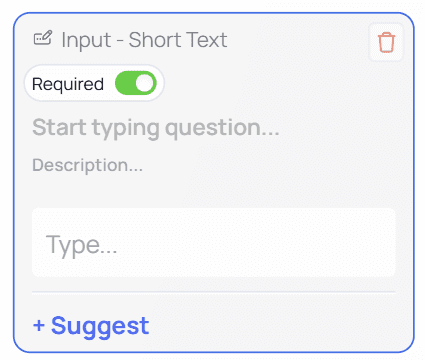
Short Text
Used for questions where answers are expected to be short, such as:
Name
Job title
City
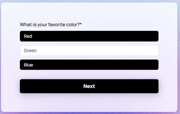
Favorite color
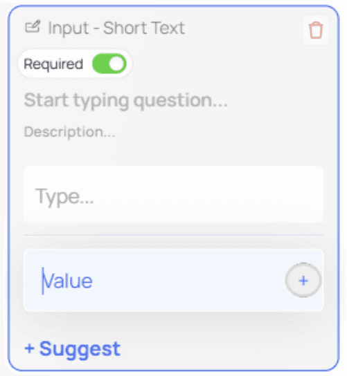
+Suggest Feature
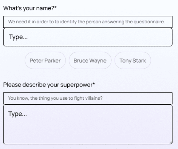
This feature lets you provide suggested responses. Users can click a suggestion to auto-fill the input.
To add a suggestion:
Click + Suggest
Enter the suggestion in the new input field
After adding suggestions, the node may look like this:
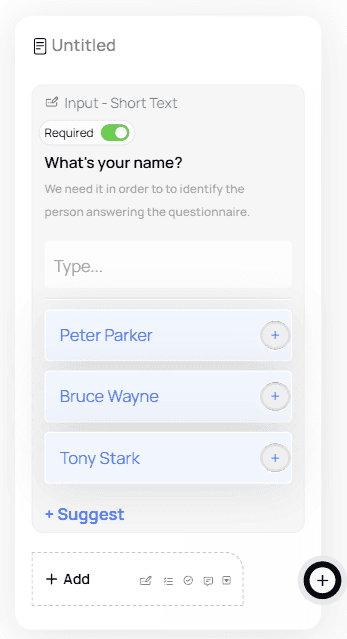
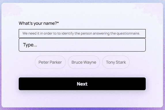
Users can click a suggestion to auto-fill their answer.
To delete a suggestion:
Click in the suggestion field → a trash icon appears → click it to remove.
💡 Tip:
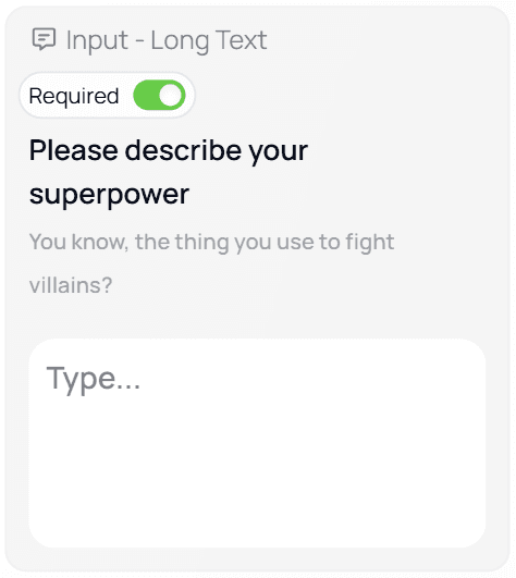
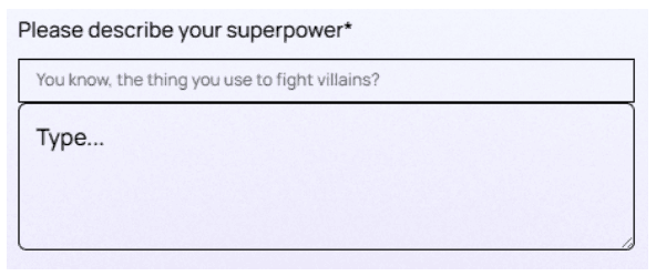
Suggestions work best for common, repetitive answers (e.g., department names or predefined labels).Long Text
Similar to Short Text, but intended for longer answers such as:
Feedback
Descriptions
Diagnostic notes
Multi-step explanations
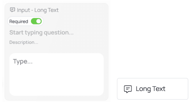
A Long Text node allows customization of:
Question name
Description
Placeholder text
Example of a fully customized Long Text node:
💡 Tip:
Use Long Text sparingly — long responses take more effort and may discourage users.Email
Used to collect email addresses.
This field includes built-in validation to ensure users enter a valid format (e.g.,[email protected]).
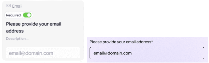
⚠️ Important:
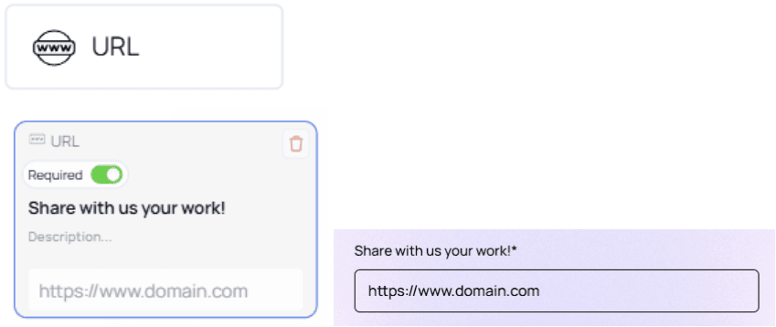
Validation only ensures the format is correct — it does not check whether the email inbox exists.URL
Allows users to submit a valid website link. Common use cases include:
Portfolio websites
LinkedIn profiles
Digital CVs
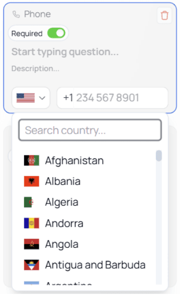
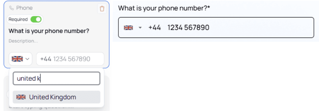
Phone
Used to collect phone numbers, with country code selection.

You can change the default country code:
Click the arrow next to the flag
Choose the desired country
Or type the country name and select it from the list
User experience on the form:
💡 Tip:
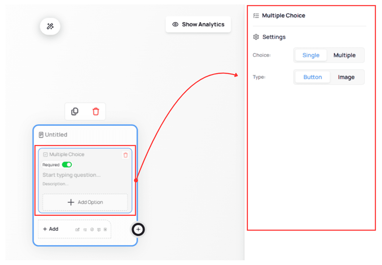
Set the default country code to the country most of your users are from.Multiple Choice
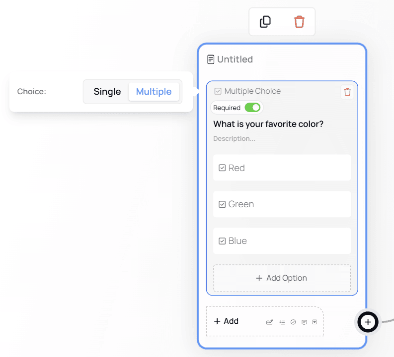
This element supports two modes:
Single Choice (select one option)
Multiple Choice (select multiple options)
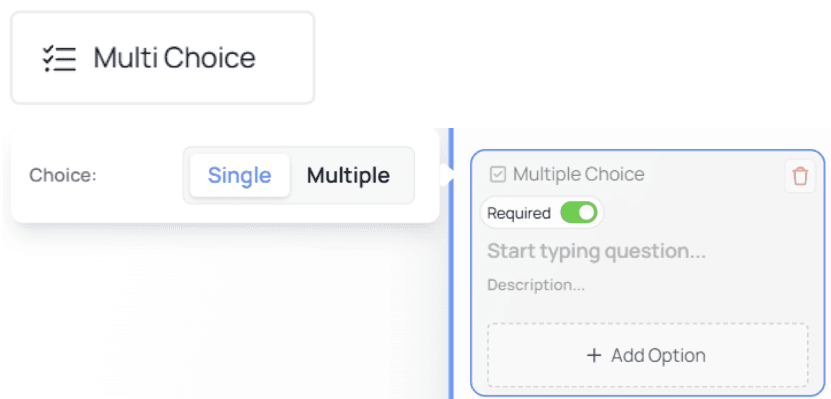
Single Choice Mode (Default)
Add options using + Add Option.
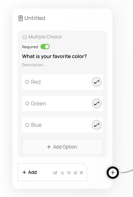
This icon indicates you can use that option for pathing (branching the flow).

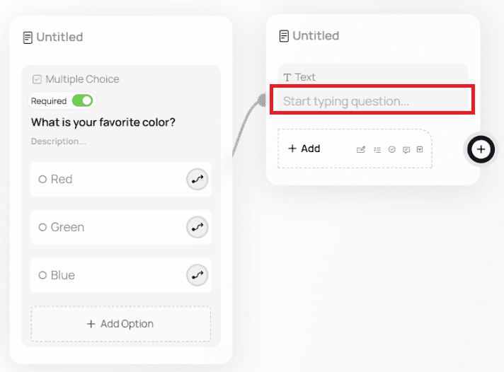
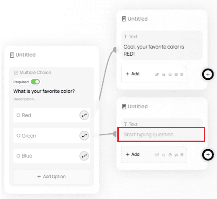
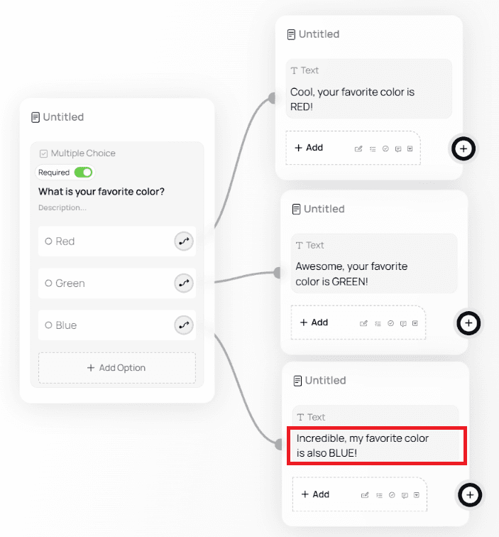
Example Single Choice pathing:
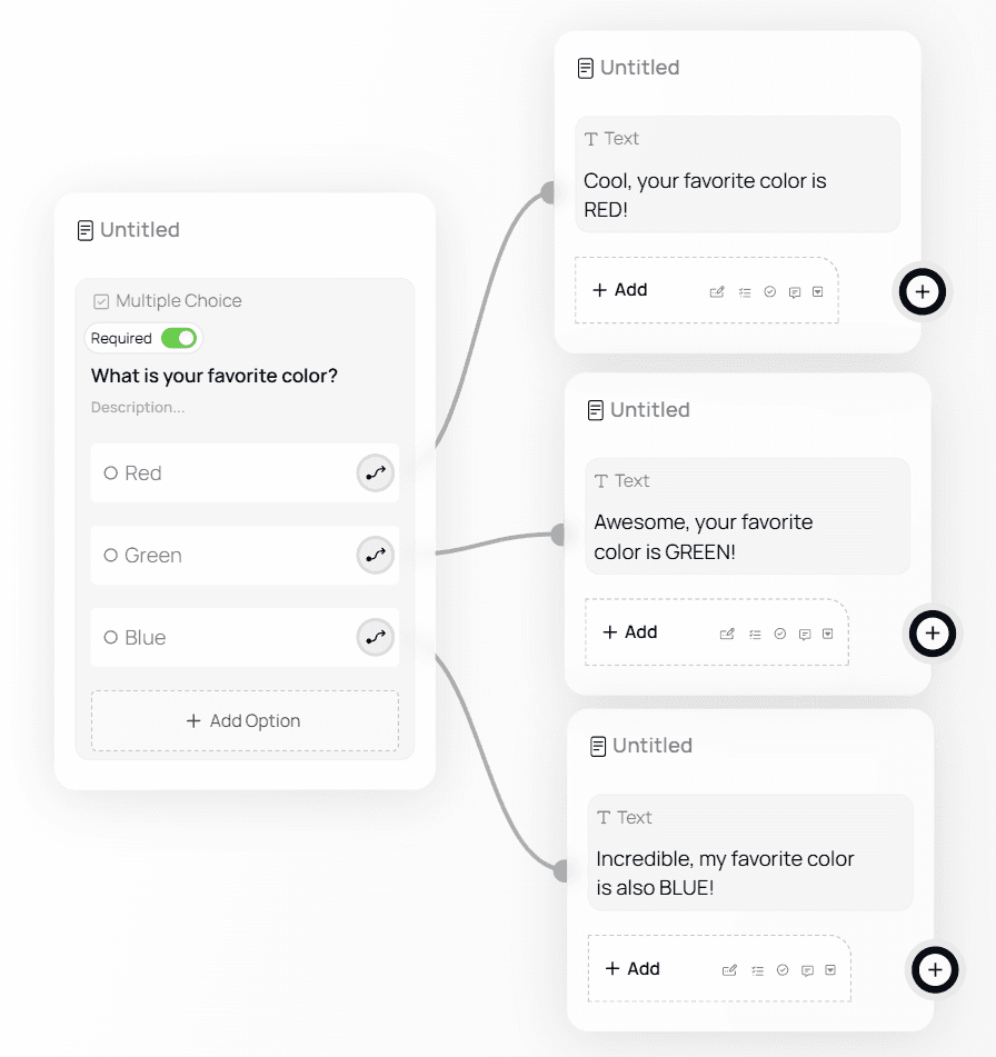
To recreate:
Click the arrow next to an option
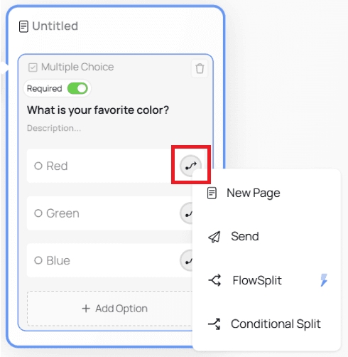
Choose New Page → Text
Enter your message for that branch
Message for Option 1
Message for Option 2
Message for Option 3
Multiple Choice Mode
When switched to Multiple Choice, pathing becomes unavailable (because users can choose more than one answer).
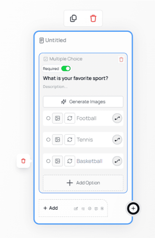
Images on Multiple Choice Options
Multiple Choice questions support images for each option, allowing you to create more visual and engaging forms.
This feature is useful for scenarios such as product selection, visual preferences, or image-based decisions.Adding Images to Multiple Choice Options
Add a Multiple Choice node to your form.
Select the node to open the configuration panel on the right.
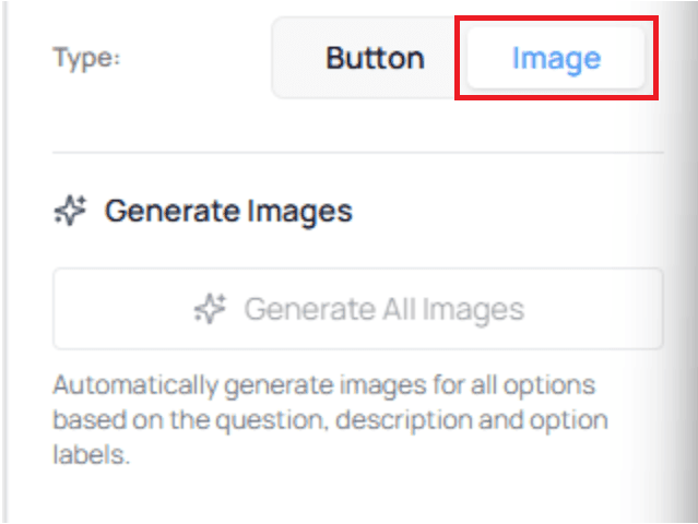
Enable the Image option.
Enter your question text and define the available options.
Adding Images (Manual or AI-Generated)
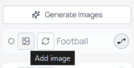
For each option, you can choose how images are added:
Generate Images: automatically create images using AI
Add Image: manually select or upload an image
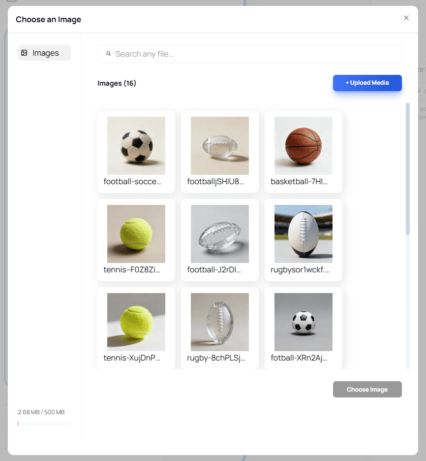
When clicking Add Image, a media picker opens where you can:
Select from existing generated images
Upload your own images using + Upload Media
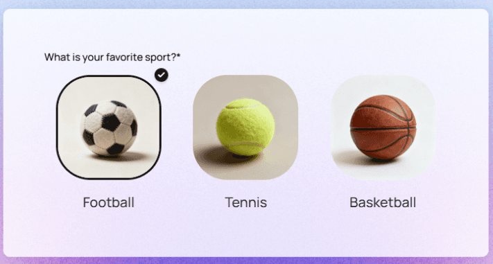
Result Preview
If you choose to generate images, your Multiple Choice question will appear with images attached to each option.
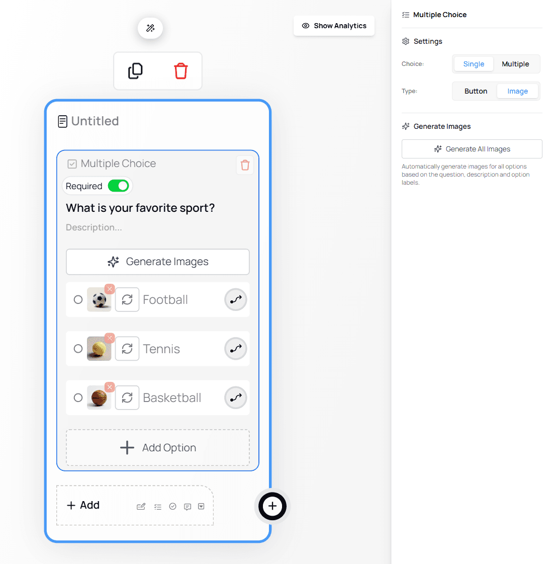
💡 Tip:
Image-based options can significantly improve clarity and engagement, especially for visual selections.Styling and Editing Images
You can further customize how images appear by opening the Style Editor.
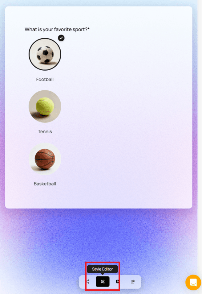
To modify an image:
Click the red X icon to remove it

Or click the image to replace it with another one

💡 Best Practice:
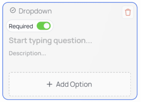
Use clear option labels alongside images to ensure accessibility and clarity for all users.Dropdown
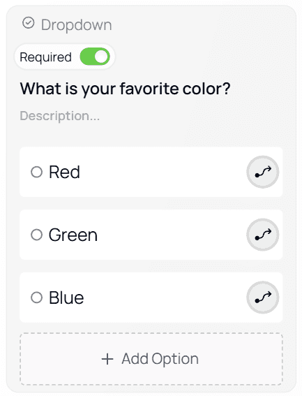
Functions like a Single Choice node but uses a dropdown menu instead of option buttons.

Example:
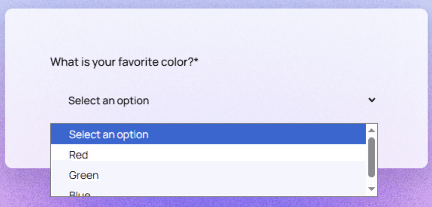
💡 Tip:
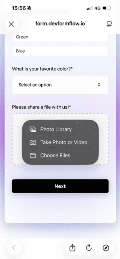
Dropdowns are best when you have many options (e.g., 20+ items) to reduce clutter.File Upload
Allows users to upload:
Images
PDFs
Documents
Screenshots
Any other supported file format

User view:

Viewing Uploaded Files
In the Results page:
Click a response
Open the Files tab
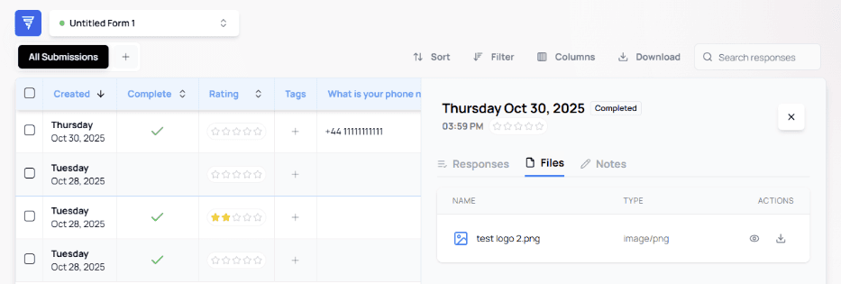
You can view or download files. Viewing opens a modal preview:


⚠️ Important:
File Upload fields may increase form submission size — avoid using too many in one form.Date
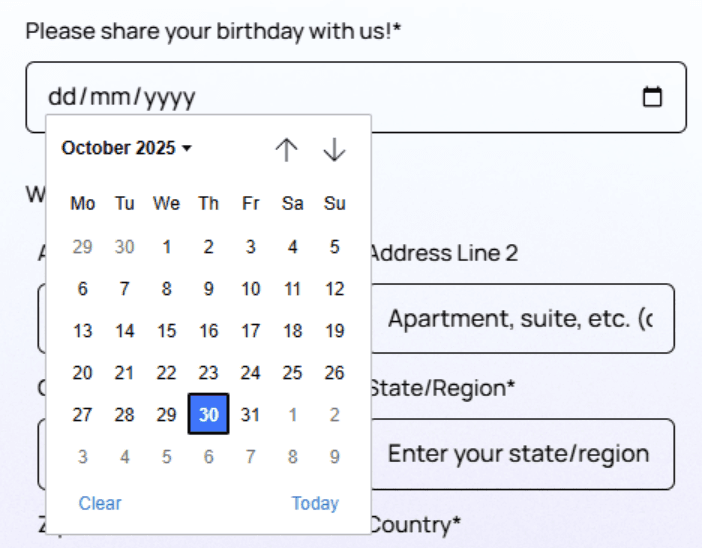
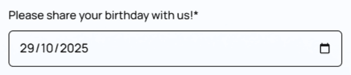
Used to collect a calendar date (e.g., bookings, birthdays, reservations).
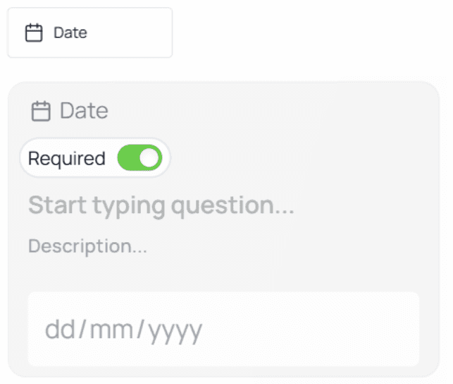
User experience varies by browser — native date pickers will appear:
Address
Comes preloaded with a default structure:
Address Line 1
Address Line 2 (optional)
City
State / Region
Postal Code
Country

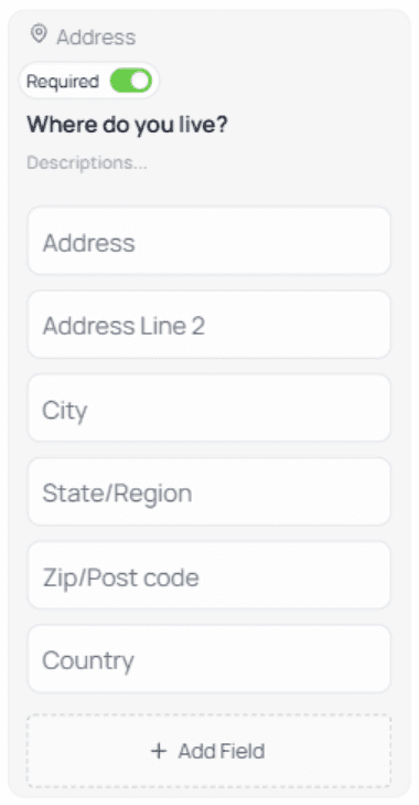
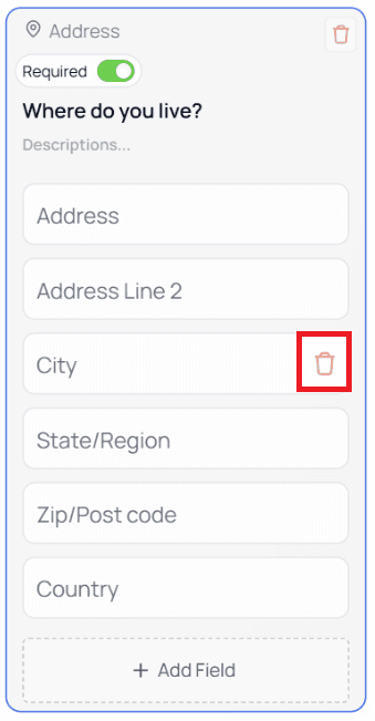
You can add or remove fields:
Hover → trash icon → delete
Before:
After:
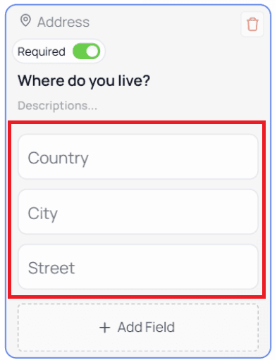
Click + Add Field to create new ones
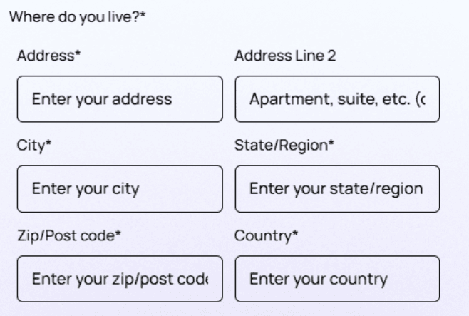
User view example:
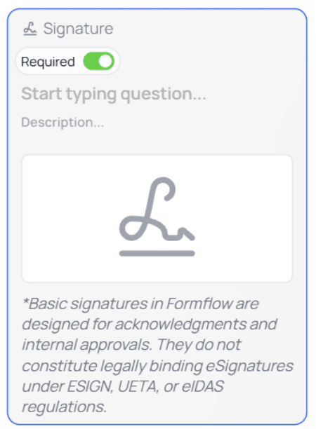
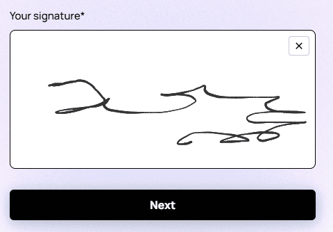
Signature
Allows users to provide a digital signature.
⚠️ Important Legal Notice:
Signatures collected in Formflow do not constitute legally binding eSignatures under ESIGN, UETA, or eIDAS regulations.
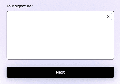
Users can clear their signature using the X icon.
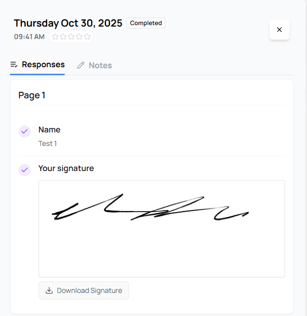
In the Results page, signatures can be viewed or downloaded.
Text (Terminal Node)
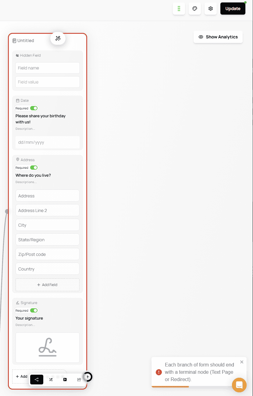
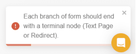
⚠️ Important:
Every path in your form must end with a Terminal Node. Otherwise, the form cannot be published.The Text node displays a message to the user and can serve as a Terminal Node to end a form flow.

If your form has any branch that does not end in a Terminal Node, you will see a publishing error.
Using a Text node at the end of a path:

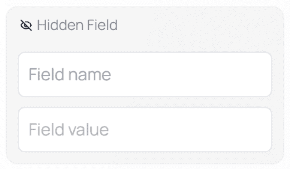
Hidden Field
The Hidden Field node is used to store or manipulate data without displaying it to the user, unless you explicitly choose to reference it somewhere in the form.

Hidden Fields are especially useful for preparing internal values, supporting automations, or structuring data for integrations — all without adding visible fields to the form.How Hidden Fields Work
A Hidden Field consists of two main inputs:
Field Name
This defines the identifier of the hidden field.Field Value
This is the value stored in the field.
You can enter static text or dynamically populate it using @Mentions.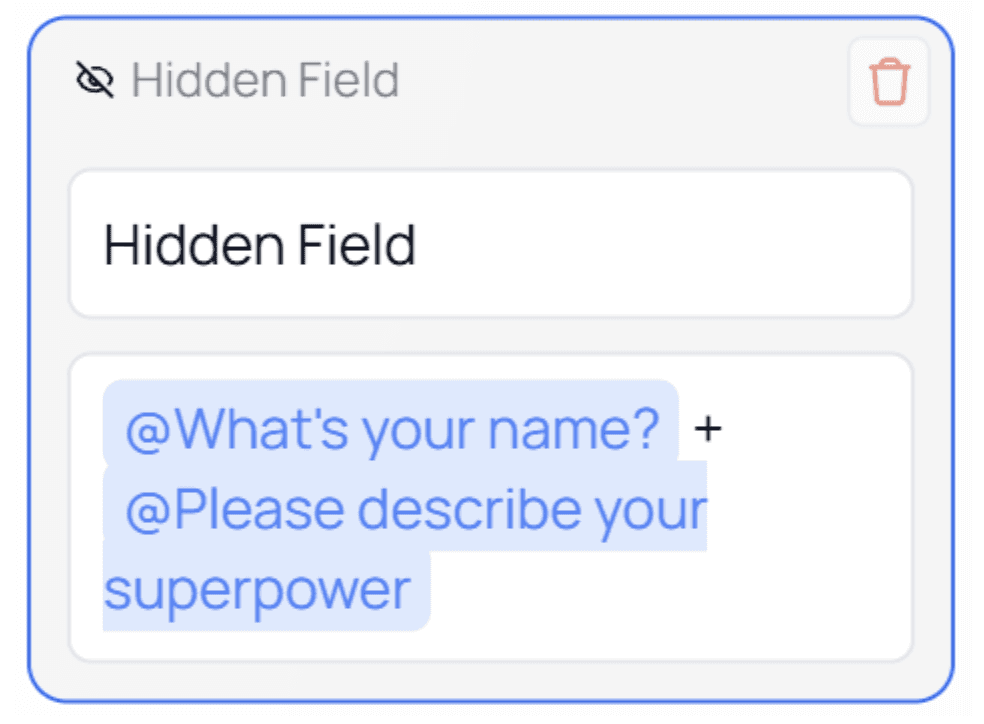
💡 Tip:
Hidden Fields work seamlessly with @Mentions, allowing you to combine answers from multiple questions, pages, or system values.Example Usage
In this example, the value of the Hidden Field is built using the answers from the first two questions in the form.
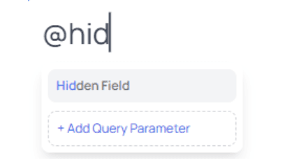
As shown above, Hidden Fields can be referenced using @Mentions.
When you type@, the Hidden Field appears in the mention list and can be inserted wherever dynamic data is supported.
By default, the value stored in a Hidden Field is not visible to the user.
It will only appear if you intentionally reference it inside the form, such as in a Text node, notification, or integration payload.⚠️ Important Notes
Hidden Fields do not appear as input fields for users
Users cannot see or edit their values unless you explicitly display them using
@MentionsHidden Fields are ideal for internal data handling, automation, and integrations
💡 Best Practice:
Use Hidden Fields to enrich your data behind the scenes while keeping the user experience clean and distraction-free.