The Style Editor allows you to customize the appearance of your entire form — including colors, typography, spacing, buttons, inputs, and more.
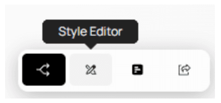
When you open the Style Editor, you’ll see the following layout:
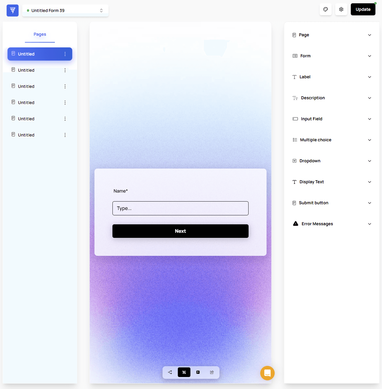
From left to right:
Page List
Navigate through all pages in your form to preview how styling updates affect each one.Form Preview
Displays changes in real time as you modify the style settings.Styling Menu
Controls all global styling options for your form.
Global Styling vs. Element Styling
Understanding the distinction between these two modes is important:
Global Styling
Affects styling for all elements of the same type across the entire form.
Example: Changing the button color updates every button in the form.
Element Styling
Applies styling ONLY to the element you select.
Ignores global styling rules for that specific item.
Useful for special cases or when certain fields need unique formatting.
⚠️ Important:
Clicking an element does not automatically switch to Element Styling.
You must manually toggle it.
How to Switch to Element Styling
When you click any element in the preview, the menu for that element will appear:
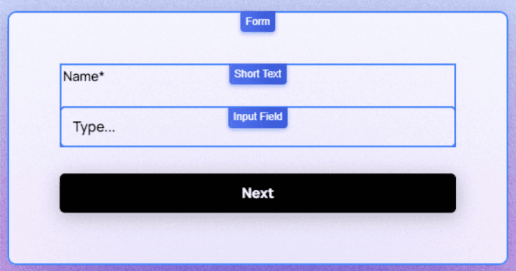
You can identify an element-specific menu by the Chain Icon next to its name.
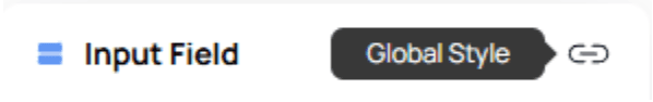
By default, the menu still operates in Global Style mode.
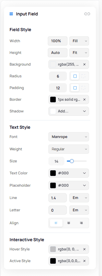
To switch to Element Styling:
Click the Chain Icon
It will change into a Circle Arrow Icon
Additional styling options for that element will become available
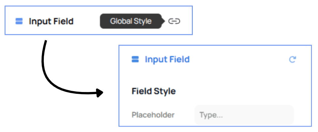
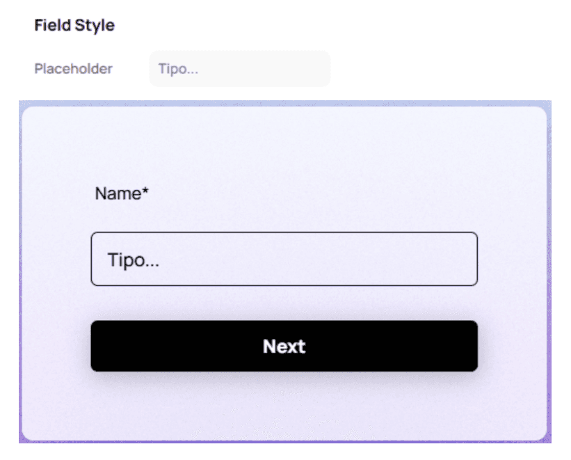
Customizing Placeholders (Element-Level Styling)
One of the most useful element-level options is Placeholder Styling.
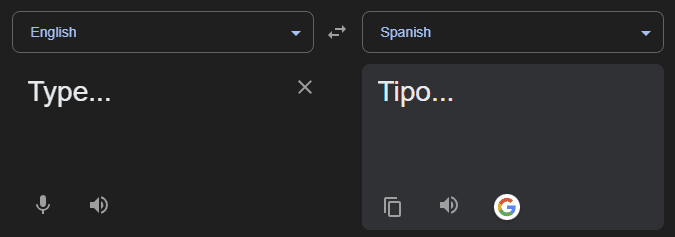
This allows you to customize placeholder text for a specific input field — for example, changing its language when your form targets a specific demographic.
💡 Tip:
Use placeholder customization to add clarity, examples, or multilingual support without modifying the actual question text.